Type: UX Design, UX Research
Client: Clifton Foundation
Role: UX Co-Designer
Team: 2 Designers, 1 Project Manager, 5 Developers
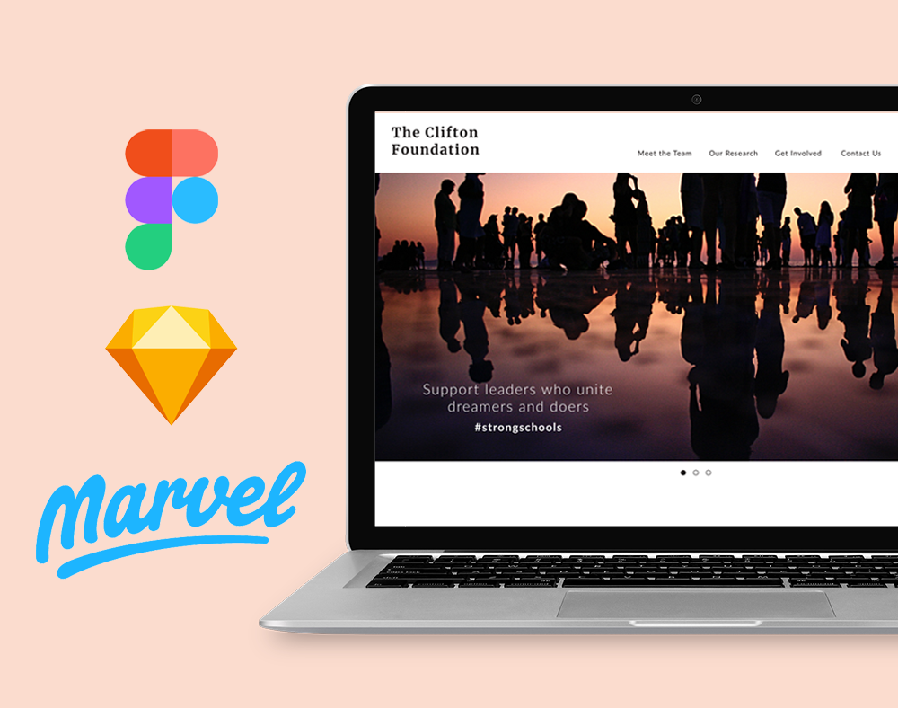
Tools: Figma, Sketch, Marvel
Stack: Python (Django), HTML/CSS
Duration: 2019 - 2020, 7 months
OVERVIEW
During my sophomore year at Tufts, I had the opportunity to collaborate with team members in JumboCode to provide free technology to aid the non-profit organization, Clifton Foundation. Clifton Foundation is an organization based in Washington D.C. and is a subsidiary of Gallup. They aim to build youth's talents through entrepreneurship programs and builder programs. These programs target high schoolers and university students with the right entrepreneurial traits and develop them.
PROBLEM STATEMENT
Although the website is the main source to spread information about the program, the original website was outdated as it had several unused links, blank pages, and different links to the same page. It also lacked the mission statement and the goal on the landing page which impeded visitors to understand the organization's aims on their first visit. Furthermore, although the Clifton Foundation aims to connect current builders or members of the program with mentors, the website had a low alumni engagement.
SOLUTION
A fully redesigned web application to provide visitors with a clear and strong message about what the organization does, aims, and researches, and to update the alumni and showcase the builders program by introducing new features to the website including private logins for builder members to access, a program feed, and directories of builders organized by cohorts and mentors.

PROCESS
🖍 Step 1: Sketch
Our first task as designers was to work on the new features that would be added to the redesigned website: the directory and the program feed.
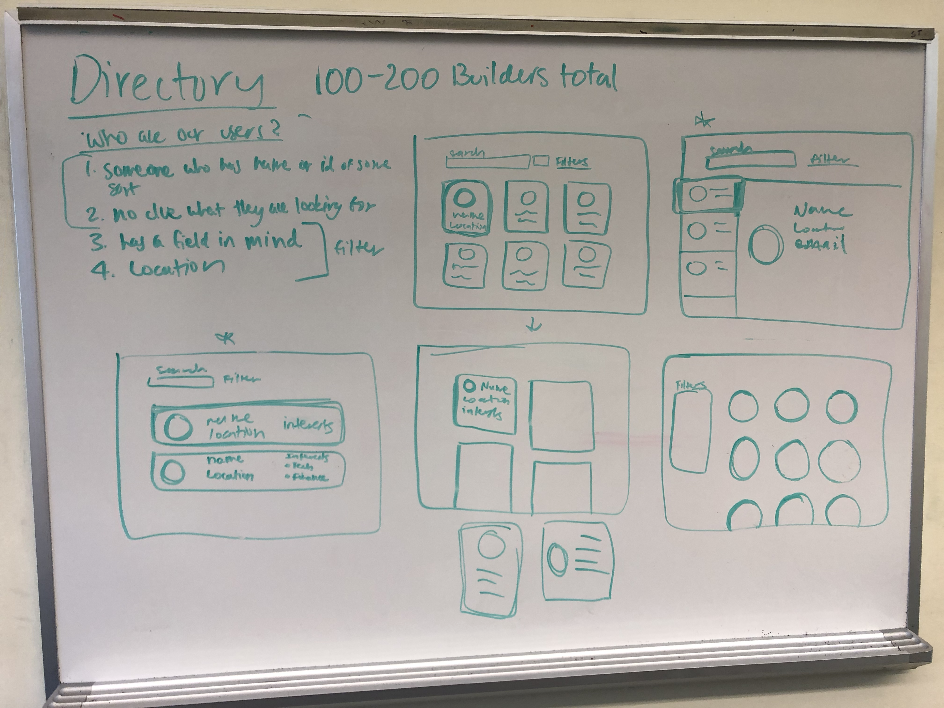
DIRECTORY
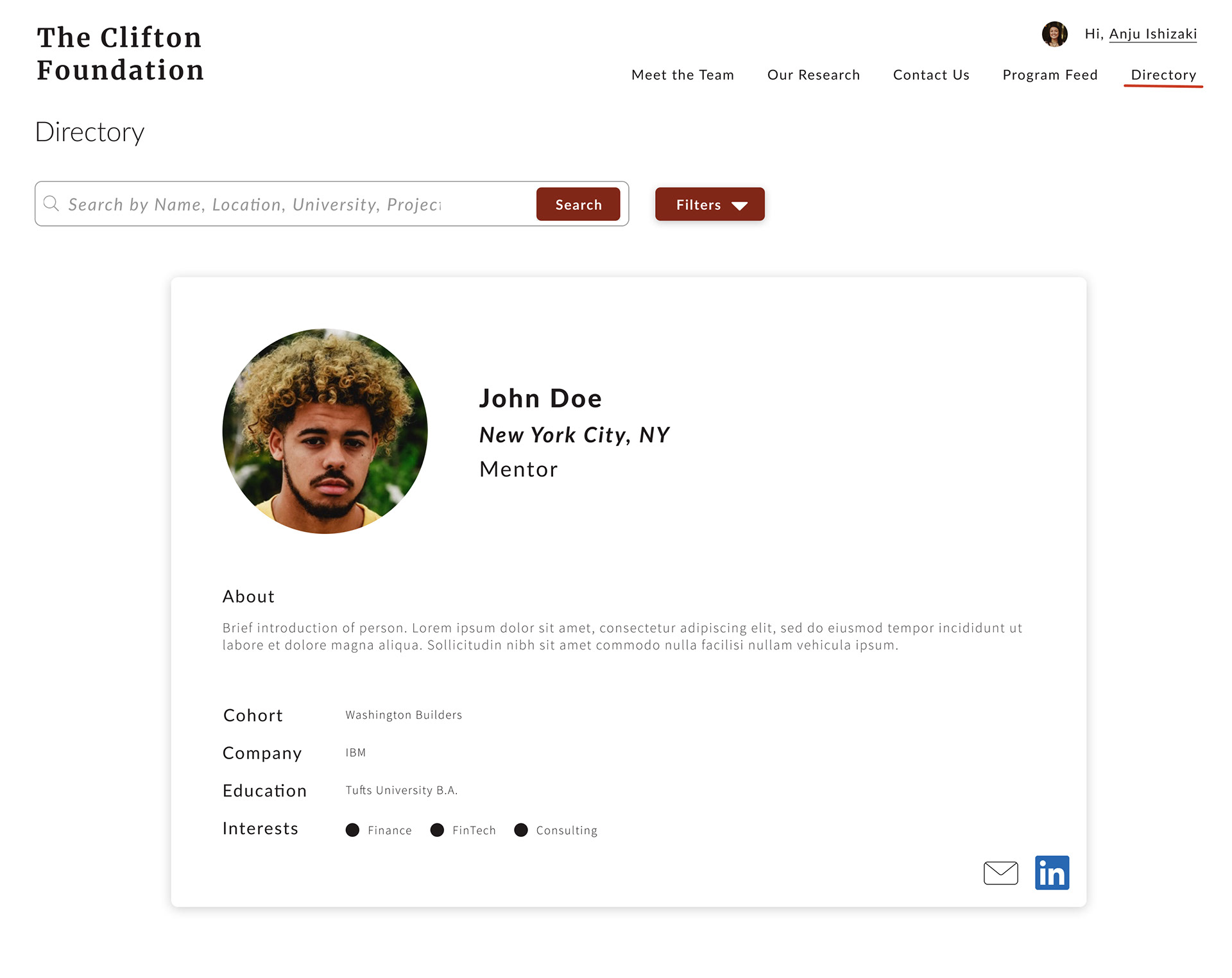
For the directory, we first decided on the elements to include in this new feature. As we want this directory to be a source of builders’ and mentors’ information during and after participating in the builder’s program, we decided to include cohorts (the program name that they were a part of), the status (builder or mentor), interests, current company and location of each individual member. These would be the filters under which members can search for others in the directory.
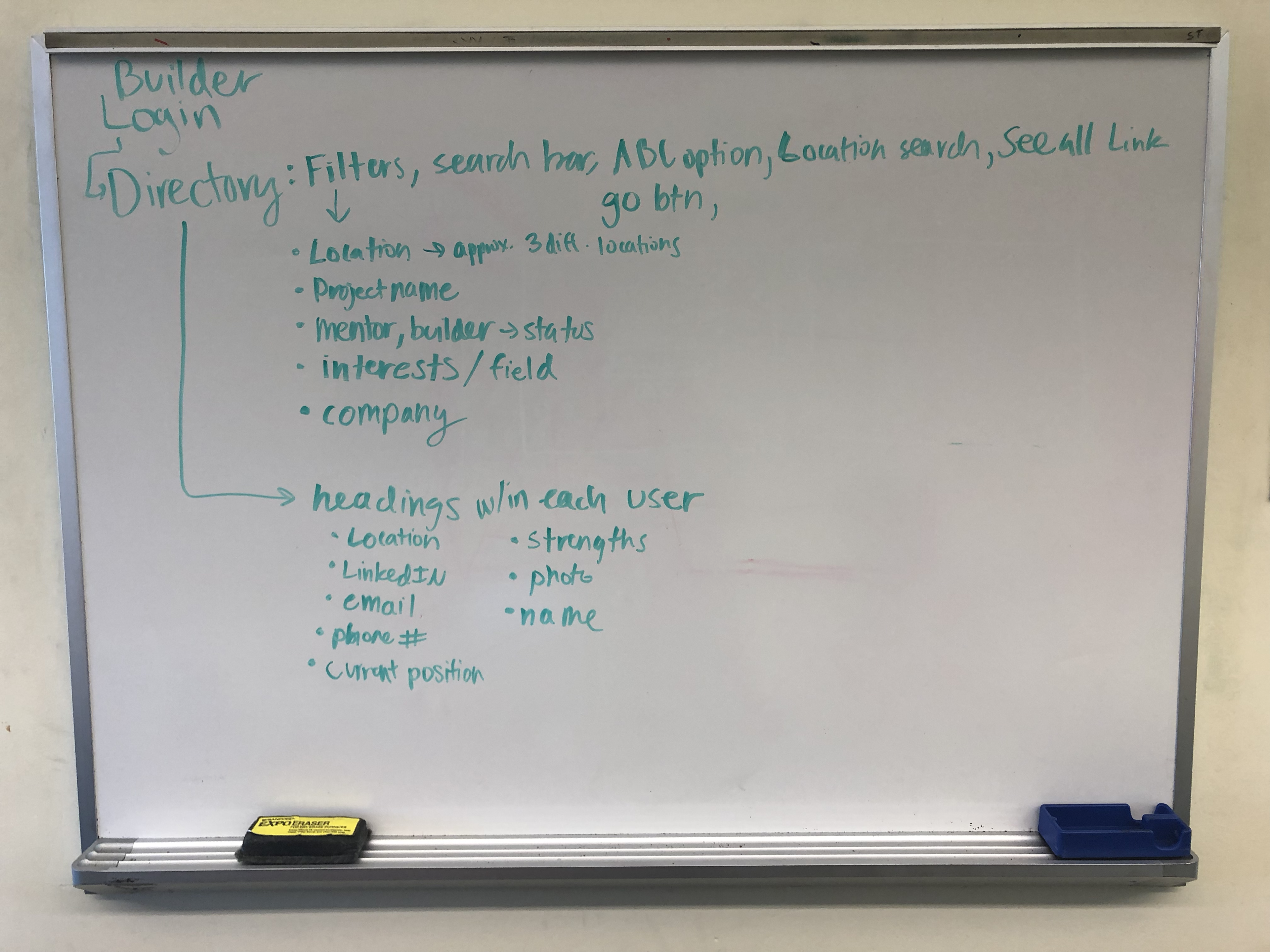
To start sketching the design, we pinpointed profiles for the directory:
・ Are range of ages from young (builders) to adults (mentors)
・ Have no clue what they are looking for
・ Has a specific field in mind
・ Wants to find a mentor in close proximity
Since people with various ages are going to be using the directory, we decided we want it to have a simple and straightforward design. We decided on displaying each individual as a card like box. On the landing page, these cards would be placed next and after one another, so users who have no clue where to search can look through some profiles before landing a search. For those who do have some idea and have a search in mind, they can use the filter in the search bar to narrow down the results to their liking.
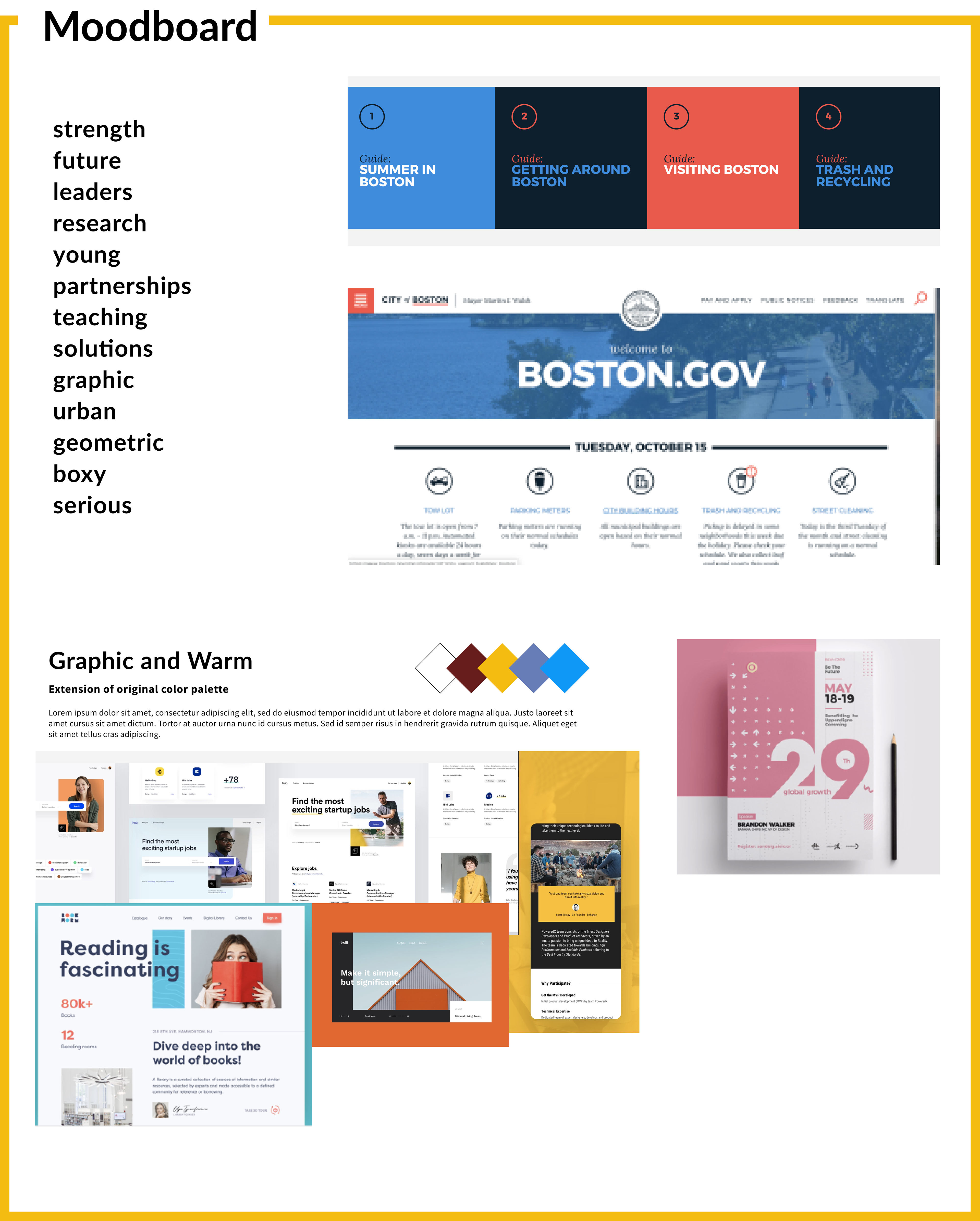
📋 Step 2: Moodboards
To choose a visual presentation of the redesigned website, we brainstormed various color schemes and styles by using Dribble and examining two websites: Boston Government and WYLD Leadership in which the client was inspired by. Both websites utilize geometric elements, urban and modern color schemes that are educational and simple. Thus, we decided with ‘graphic and warm’ as our inspiration.
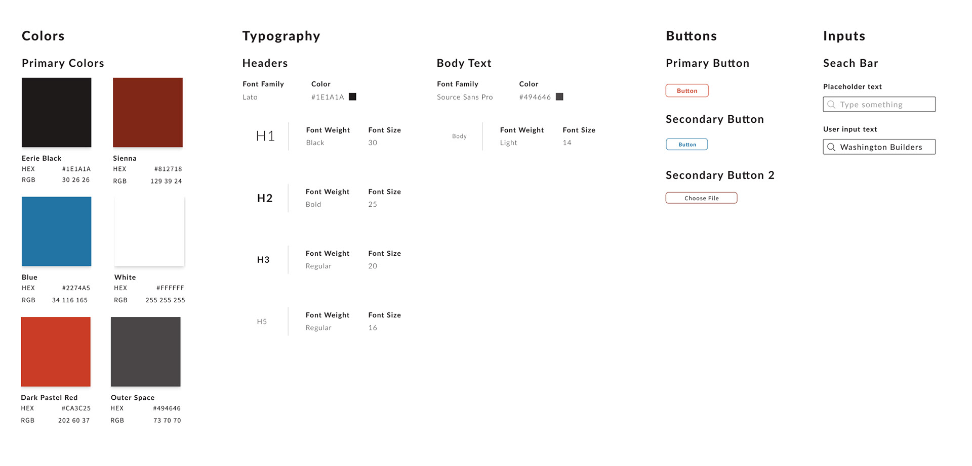
📚 Step 3: Style Guide
After having a general design direction, we decided to utilize the strong dark red used in the current website as the main color for the redesigned one as well. In order to create a more sophisticated and modern look, we also included a lighter red color, along with a bold blue color to pop out important elements.
🔧 Step 4: Wireframes
To understand the display of the organization’s content and to define information hierarchy, we created wireframes for the directory and program feed.
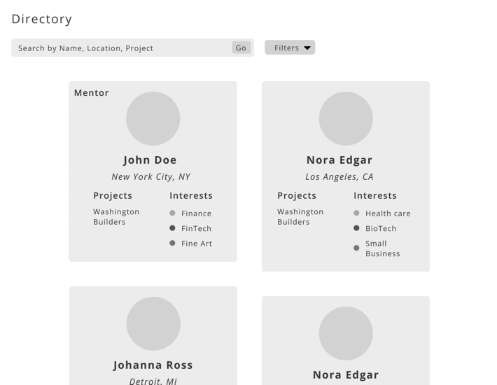
DIRECTORY
Following our sketches, we designed various ways in which the user information can be displayed on the card shown below.
Incorporating the upcoming events page into our new program feed page, we created wireframes for this new feature as well.
Incorporating the upcoming events page into our new program feed page, we created wireframes for this new feature as well.
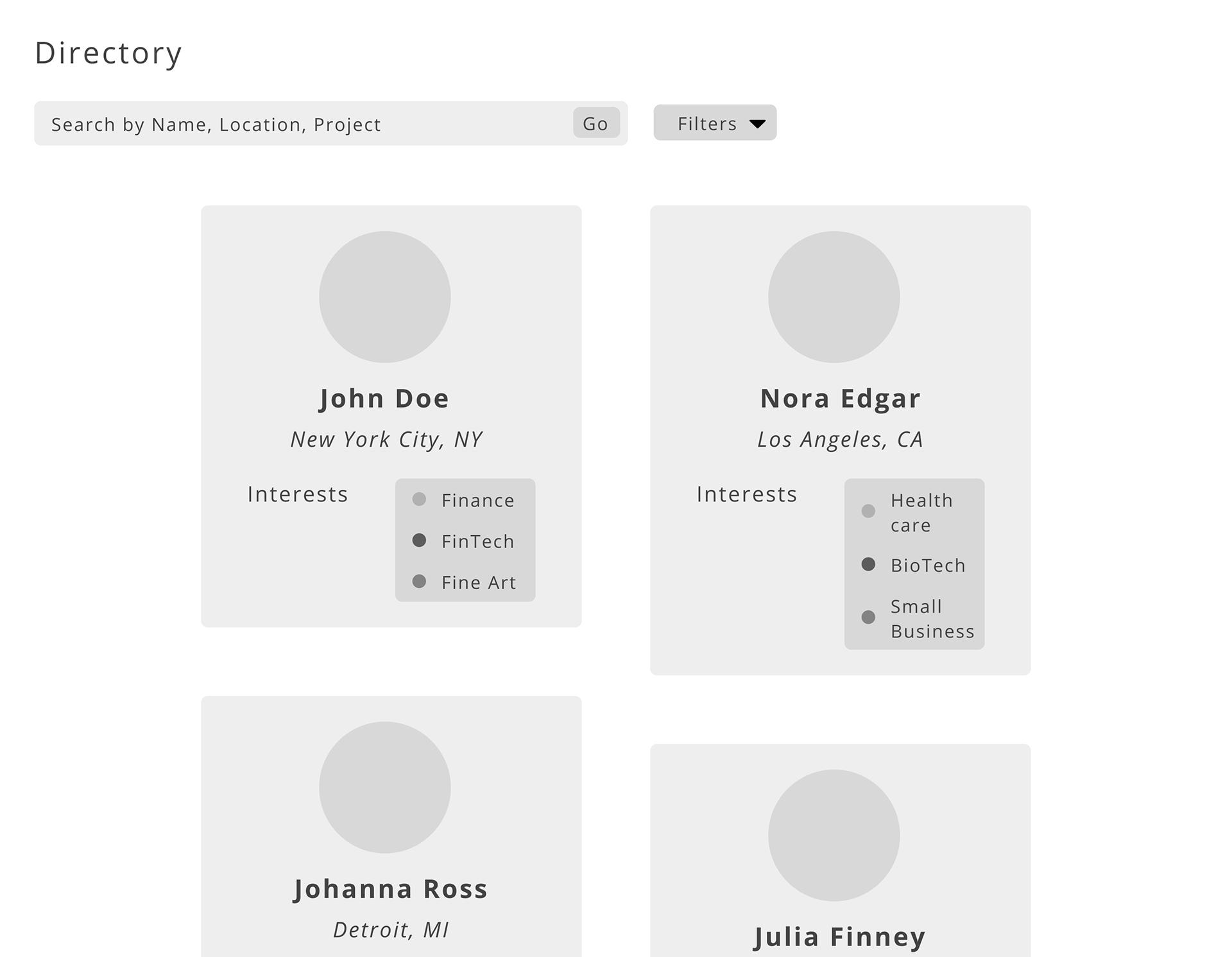
Directory Ver.1
Directory Ver.2
Directory Ver.3
Under the search bar lies filters, which have two sections: location and interests. Users can type a location in the respective filter to choose one from a dropdown menu, and can click on desired interests from a checkbox menu.
PROGRAM FEED
Similar to the directory, we decided on the elements to include in the new program feed. As we wanted this to be a platform in which both current and past builders and mentors can interact with one another and share information, an email function was idealized. When users want to share information, they can do so by posting as well as informing others via email. By implementing this to the ‘new post’ feature, communication will be easier and efficient as users will no longer need to type the information twice. We created tags to filter the various posts. In addition, we decided to incorporate ‘upcoming events’ at the top of the program feed page so that users can update members with important and relevant events, and do not have to move out of the feed into a separate events page.
For these first wireframes, we created four different variations of what each post would look like. These posts will be able to hold different files, mainly images.
For these first wireframes, we created four different variations of what each post would look like. These posts will be able to hold different files, mainly images.
Program Feed Ver.1
Program Feed Ver.2
Program Feed Ver.3
Program Feed Ver.4
As for updating new posts, we had two ideas: pop-up menu and dropdown menu shown below. Continuing to the new step, we decided to go with the dropdown menu.
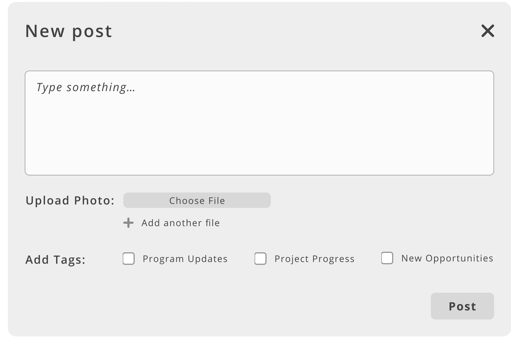
New Post Pop-Up

New Post Drop-Down
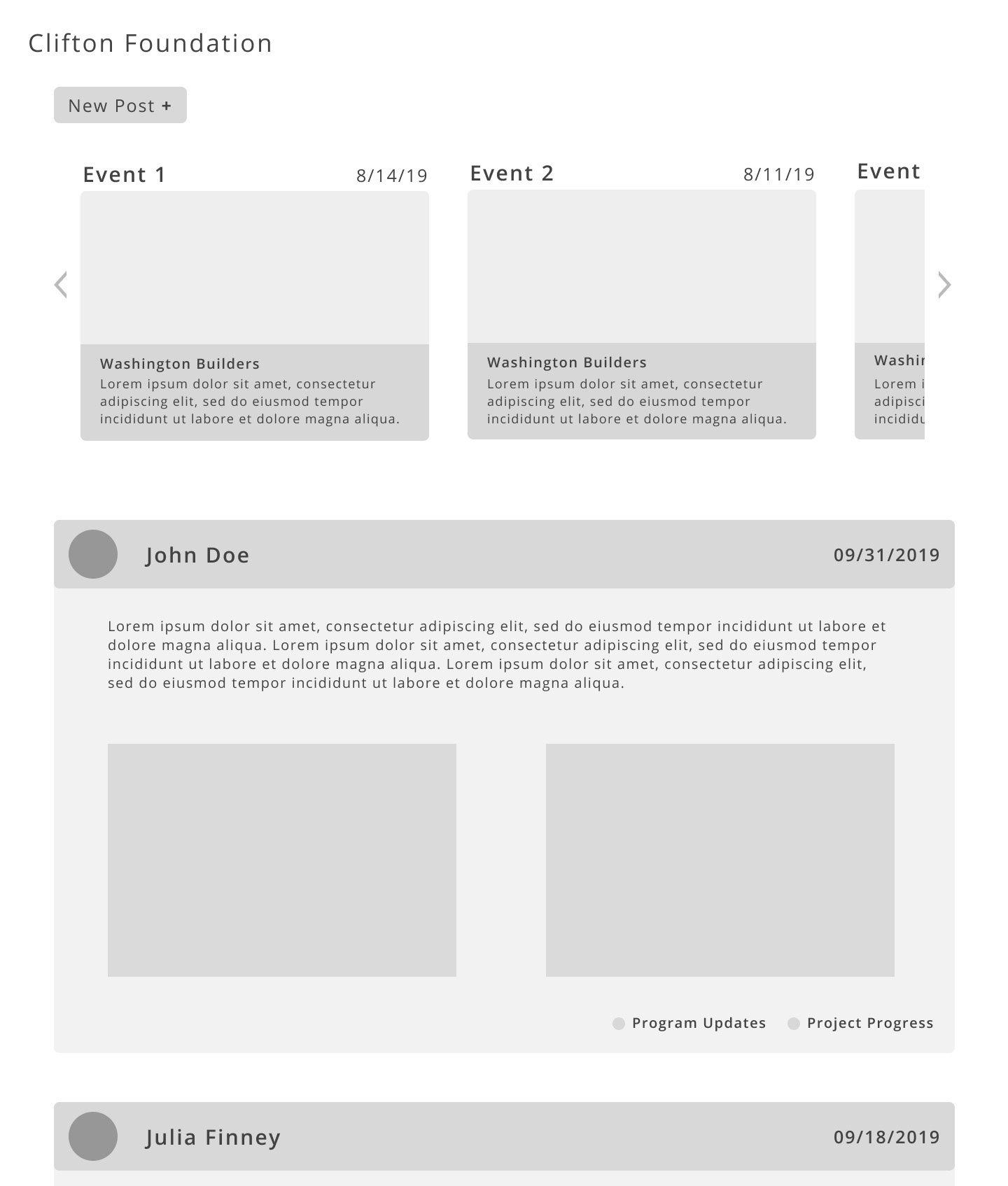
Combining the events and the post features, we created our first program feed wireframe.
📲 Step 5: Mockup
Through the next few months after creating the wireframes, we created, modified, and updated mockups through discussions with the client and the developers on our team. This section will go through the two and the final version of the mock-ups, with each being divided between the directory, programfeed, and other website elements.
MOCKUP VERSION 1
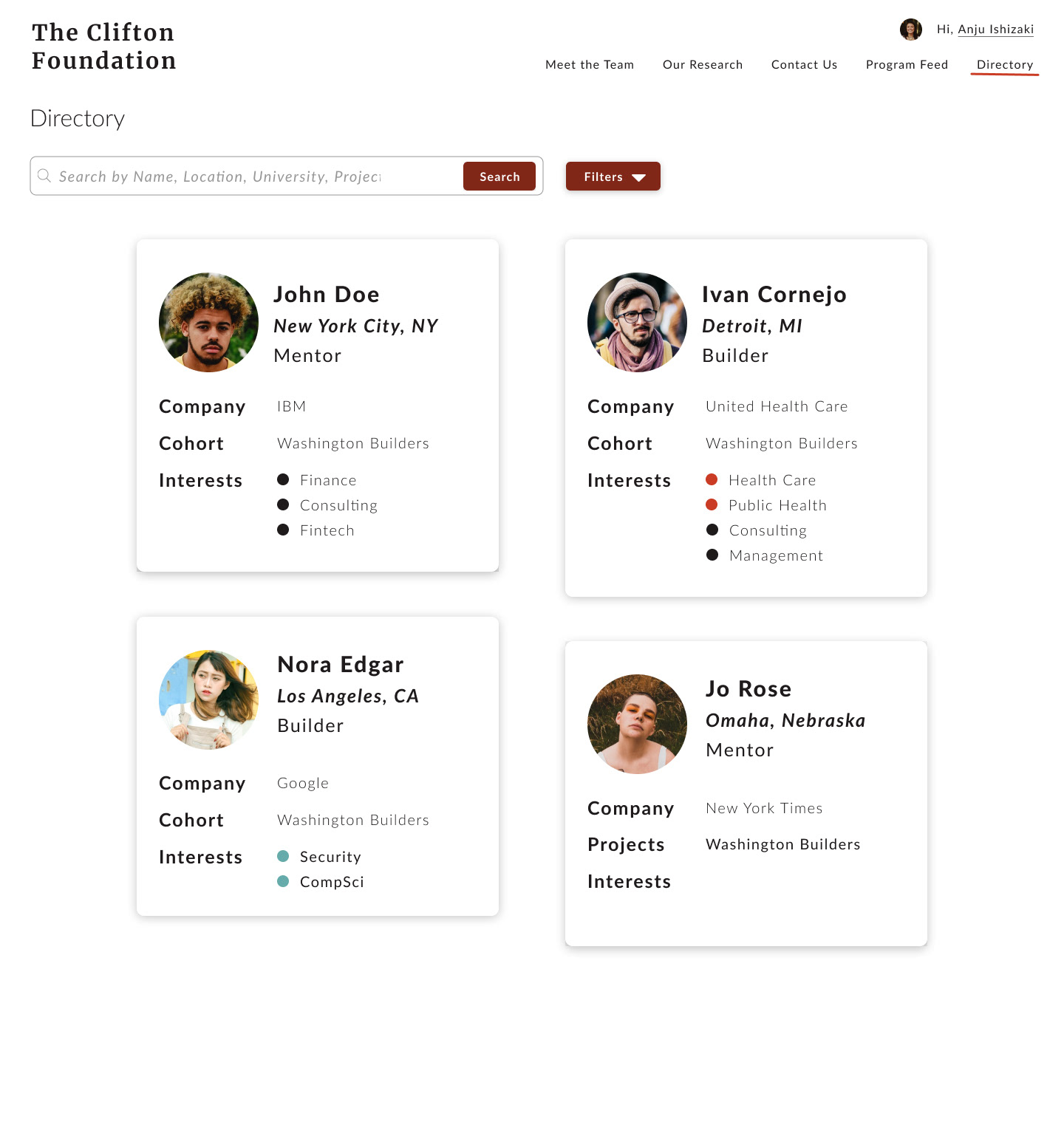
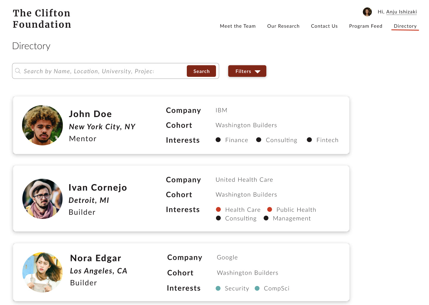
DIRECTORY
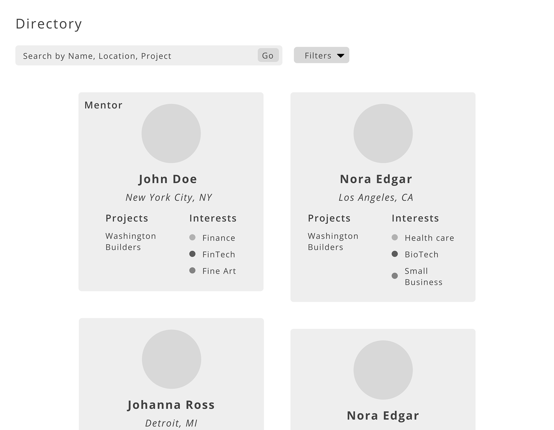
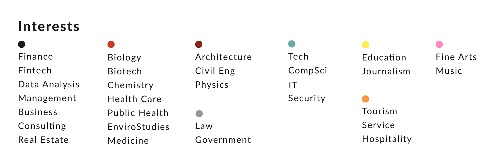
In order to create our first mockup for the directory, we came up with various filter interest items that would be displayed in each card, which could then be used as a filter to search for users in the directory. We named some general interest terms such as ‘Consulting’ or ‘CompSci’, grouped them into relevant categories, and labeled them with a specific color circle that would be displayed along with the interest term. This way, users can visualize what different or similar field interests some builders work with and how they relate to the mentors’ companies.
Following the low-fidelity wireframes with various card displays, we created high-fidelity wireframes for three types: staggered boxes, simple fixed sized boxes, and horizontal boxes. After discussing with the developers and receiving feedback from the client, we decided to implement the cards with simple fixed sized boxes as it is more code-friendly. With the staggered boxes, not only are the boxes non-reusable, but also might look unrefined when they are very offset from one another. Although the horizontal boxes are more compact and eliminate white-space, it does not look modern, and instead makes the website cramped and hard to look at.
Directory Ver.1
Directory Ver.2
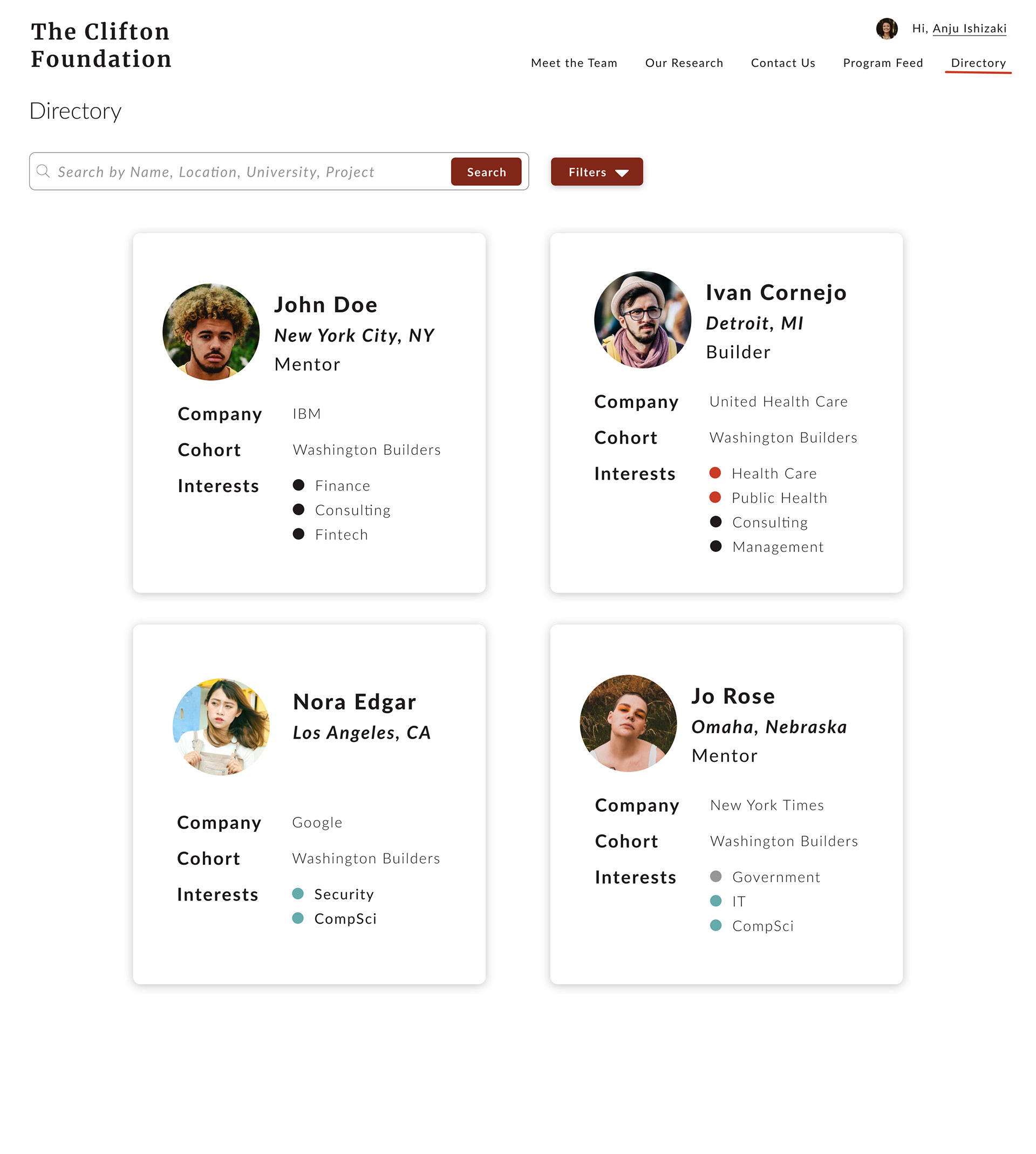
Directory Ver.3 - Proceed with this!
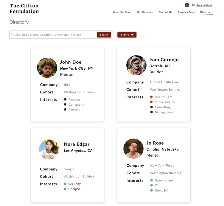
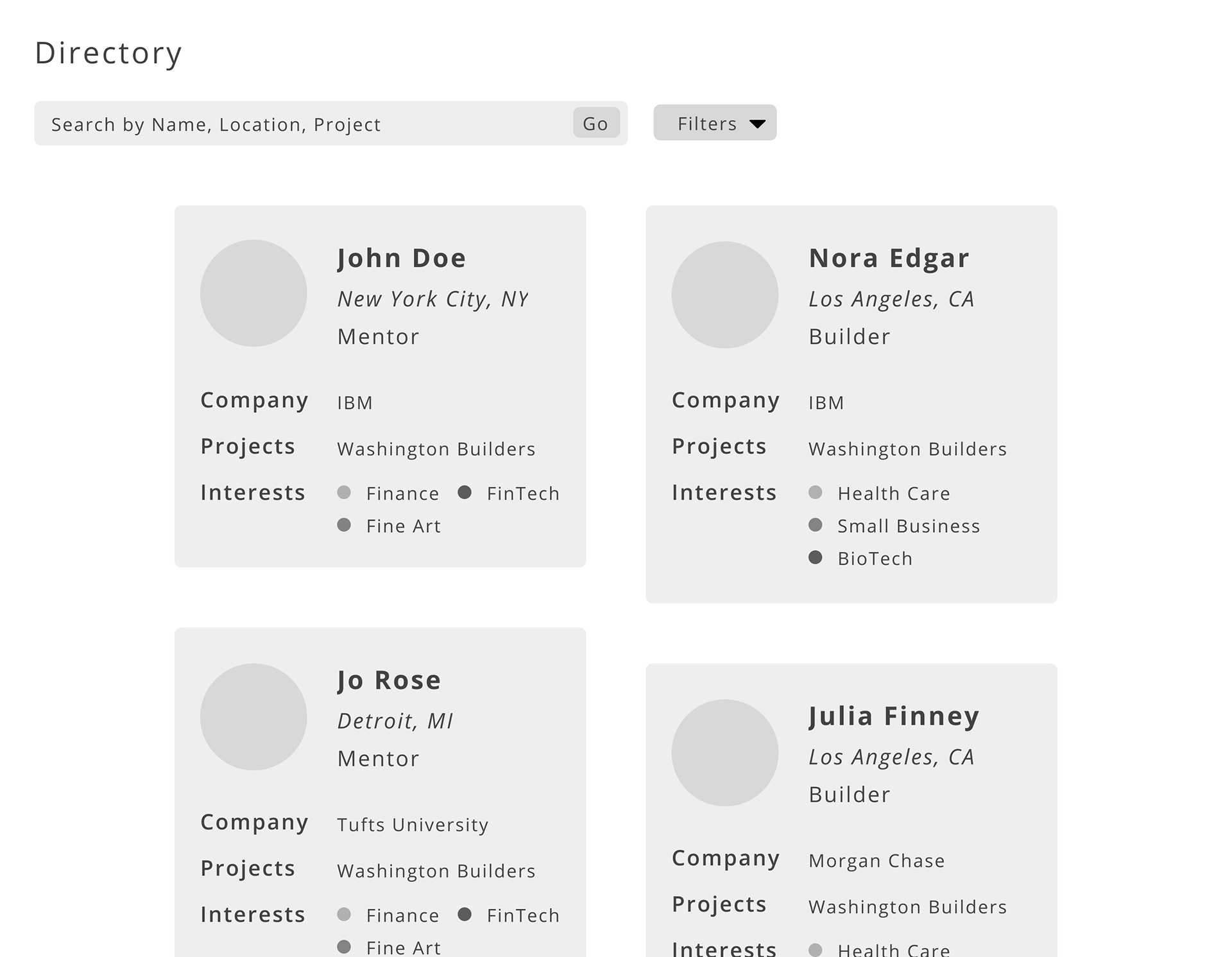
The search tab was also modified from the previous wireframe to include more filters. Since the directory is meant for builders and mentors, there is other crucial information that should be used as filters: cohorts and roles. Cohorts are the essential part of the builders program, and could be used to identify alumni or current builders. The role checkbox allows users to narrow down their search to those who are looking for internships and job opportunities, or to those who are seeking for new hires or interns to add to their company.
Once the user clicks on a certain user profile, it will take them to the individual’s profile card page, which spans most of the page. This card will include additional details about the user including a short description, email address, and a linkedin profile.
PROGRAM FEED
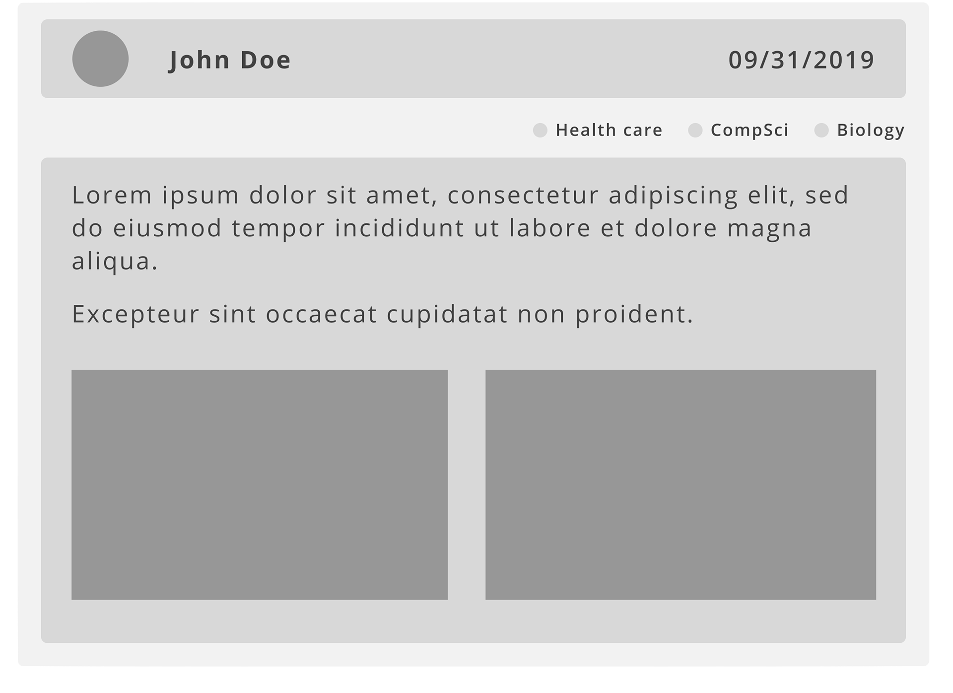
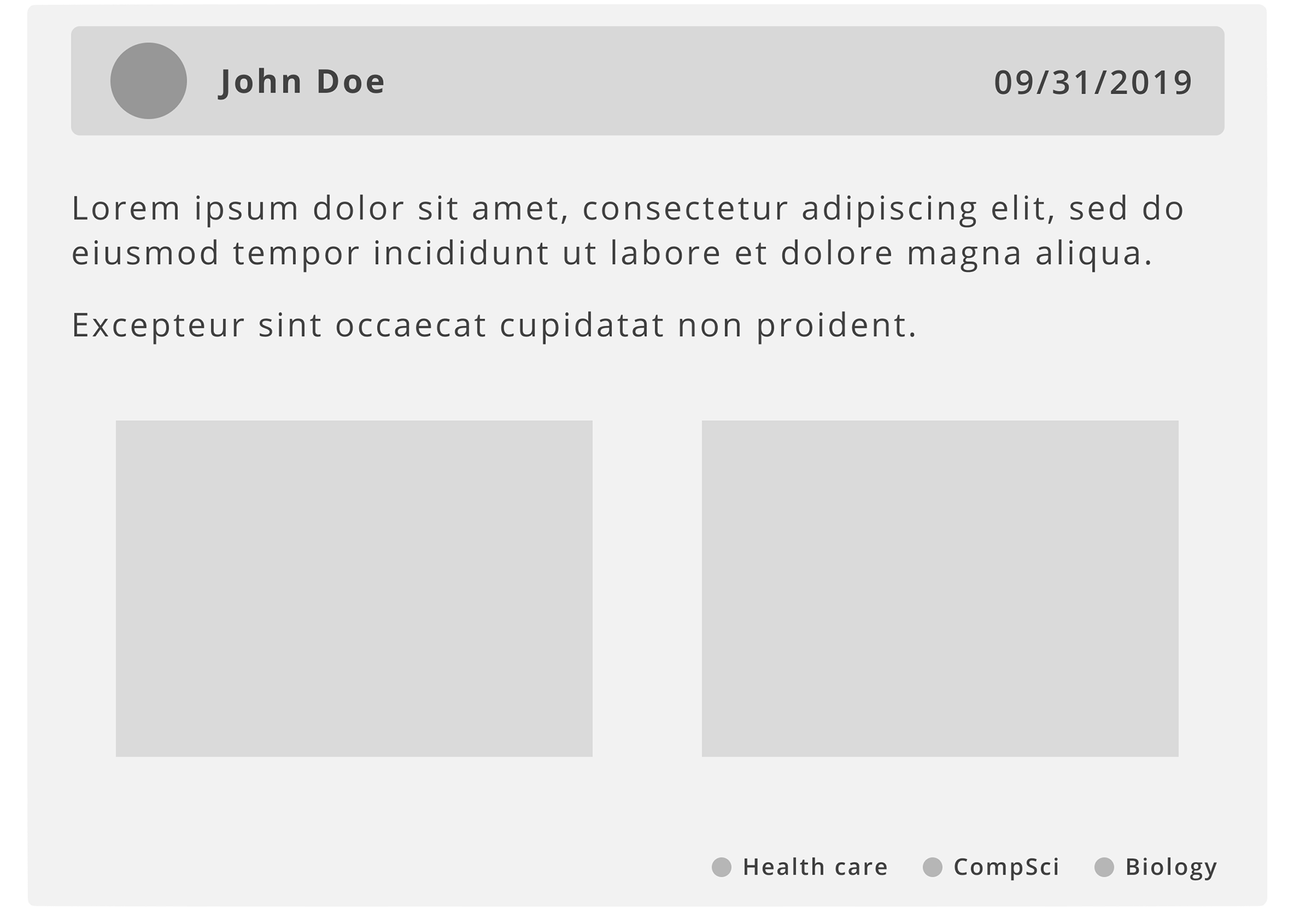
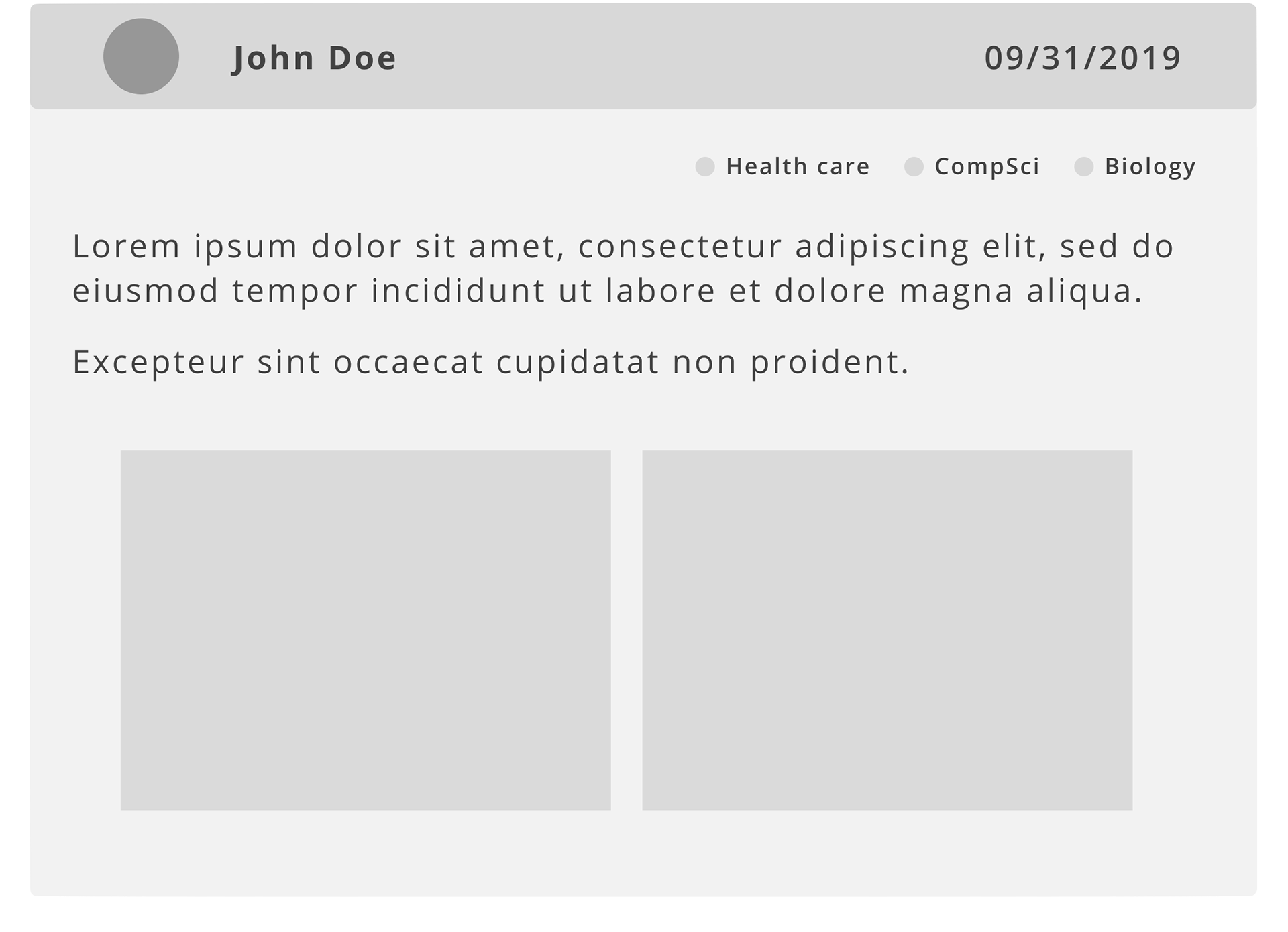
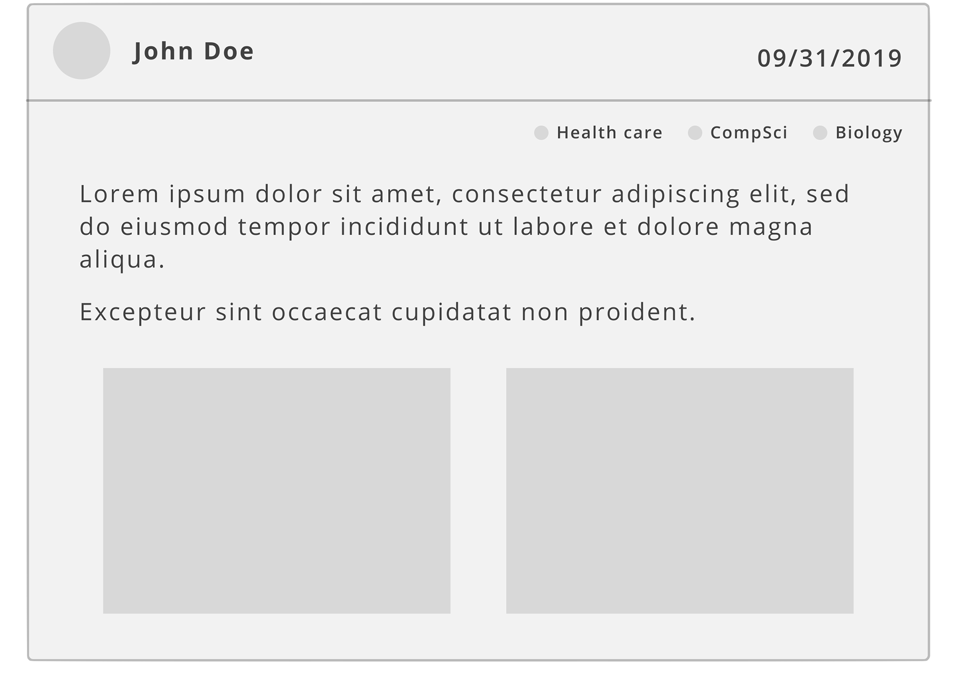
The first high-fidelity wireframe for the program feed also followed the previous design, including the upcoming events scroll section at the top, along with the posts section where users can update to the other builders and mentors.
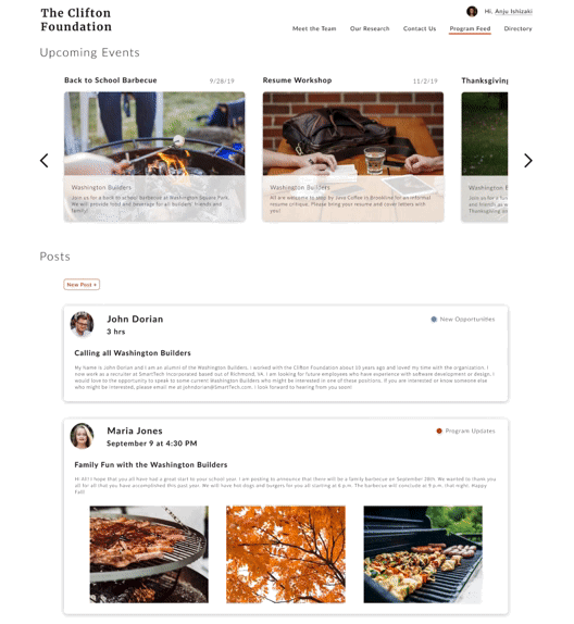
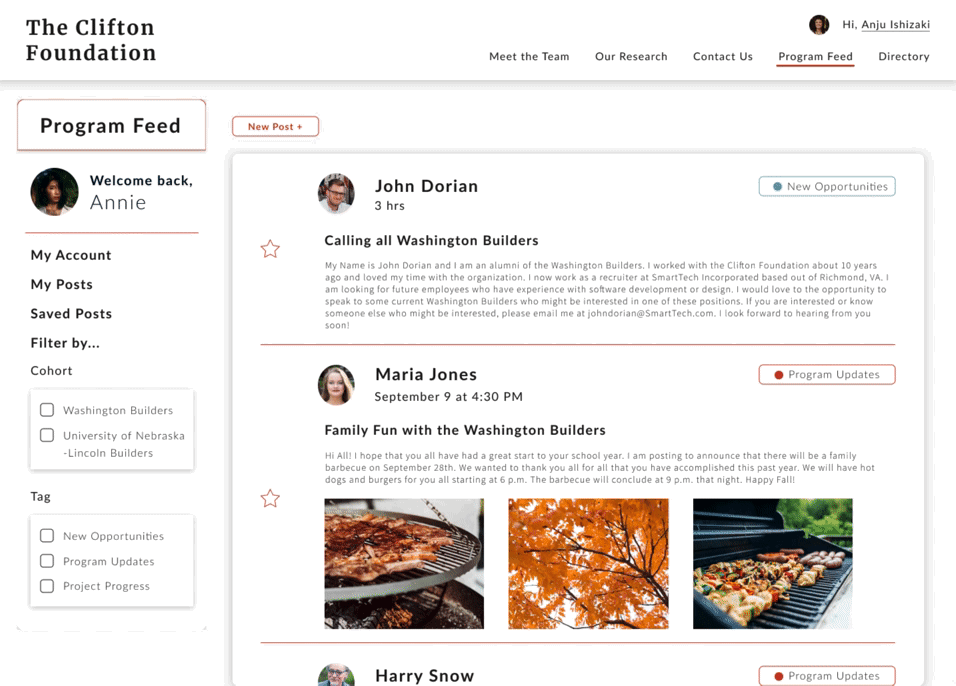
However, since the organization no longer uses and has not updated the current event calendar, we decided to eliminate it from the program feed for the future designs. Instead, we added a menu toolbar on the left hand side that controls the information of the logged in user and their posts. Users can also save others’ posts and search by filtering it through tags and cohorts. Tags will be required when posting. They include ‘New Opportunities’, ‘Program Updates’ and ‘Program Progress’. Users can then choose their cohorts to specify which builder program they are referring to about in the post.
We also designed the other website pages as well, deciding the overall flow of the redesigned website.
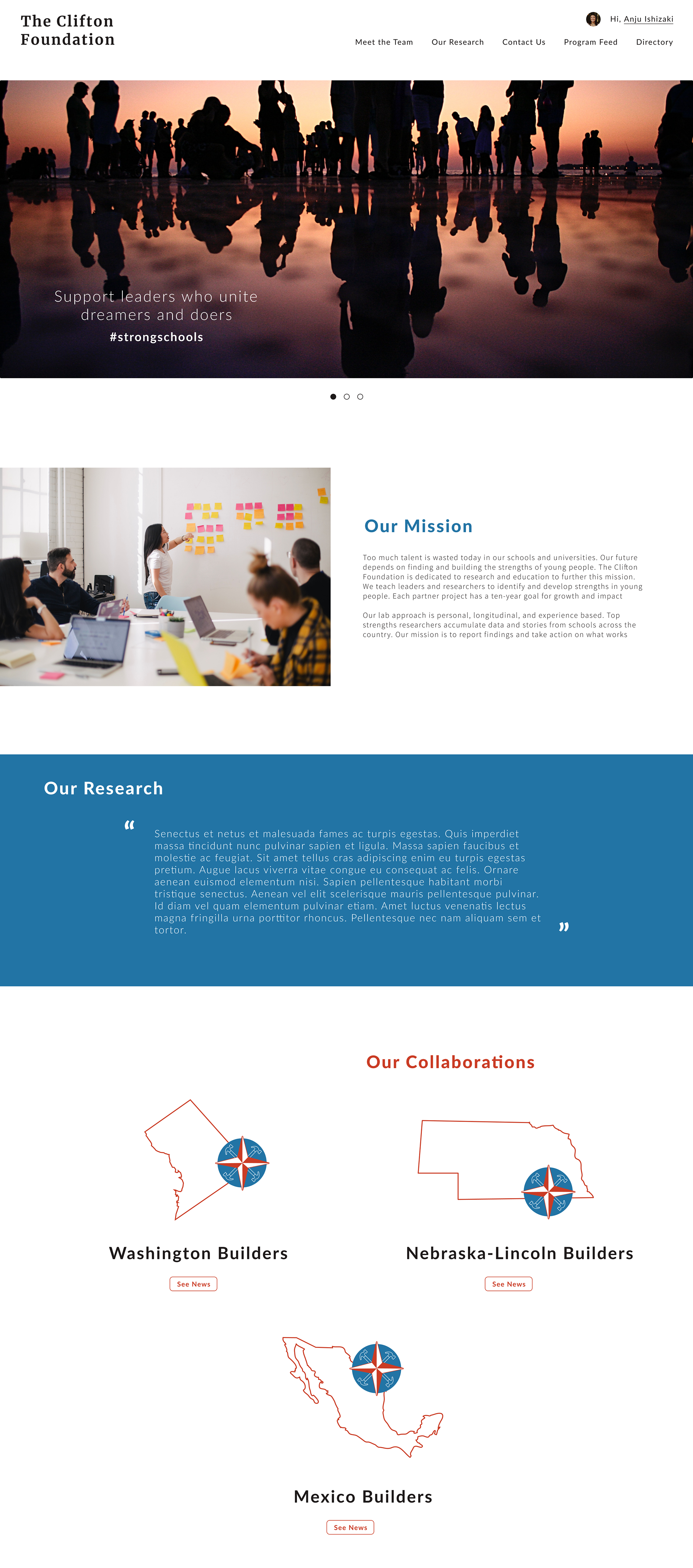
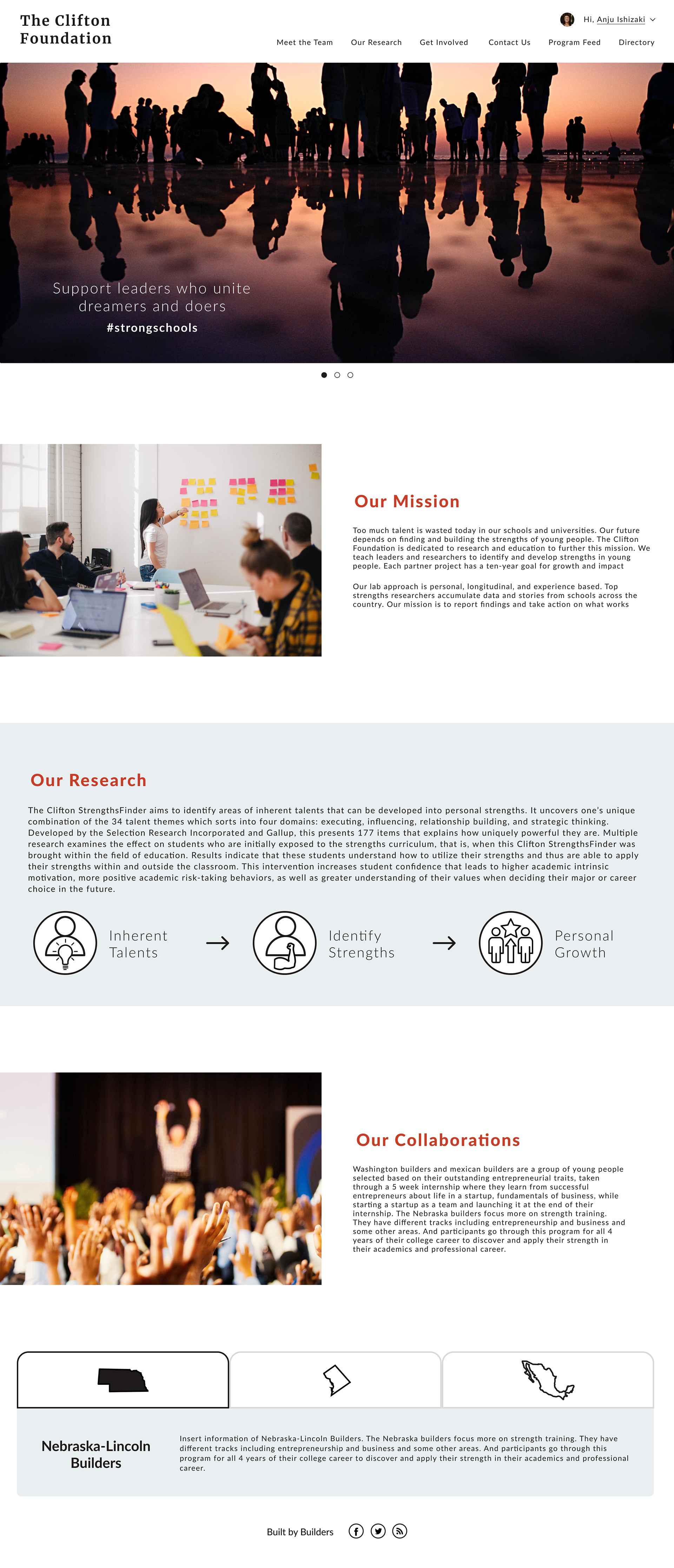
HOME PAGE
As per request, the landing page will have a slideshow of images with organization captions and hashtags. This will be similar to the current website, showcasing three different images but updating with high quality and recent pictures of builders and mentors.
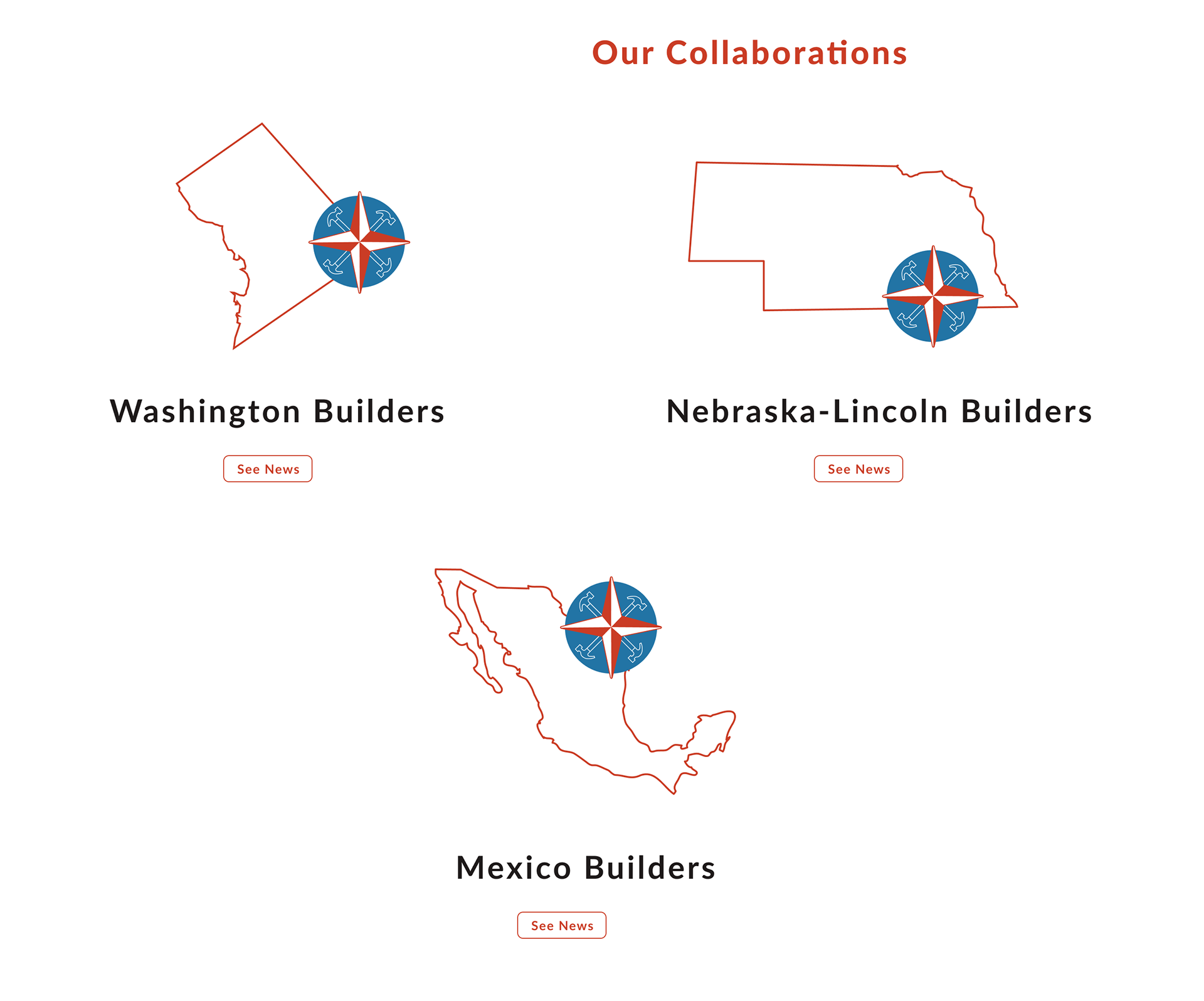
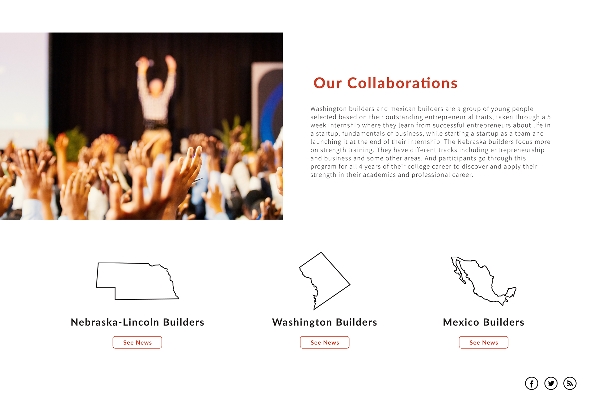
As mentioned in the challenges section, we wanted to redesign the whole homepage to include strong and relevant messages for the first time and returning visitors by including the mission statement, a slideshow of pictures, and the research statement. Finally, in order for visitors to see the various builders programs the organization offers, we have included a graphic link at the bottom of the page including the names and images of the three programs.
As mentioned in the challenges section, we wanted to redesign the whole homepage to include strong and relevant messages for the first time and returning visitors by including the mission statement, a slideshow of pictures, and the research statement. Finally, in order for visitors to see the various builders programs the organization offers, we have included a graphic link at the bottom of the page including the names and images of the three programs.
Collaborations Ver.1
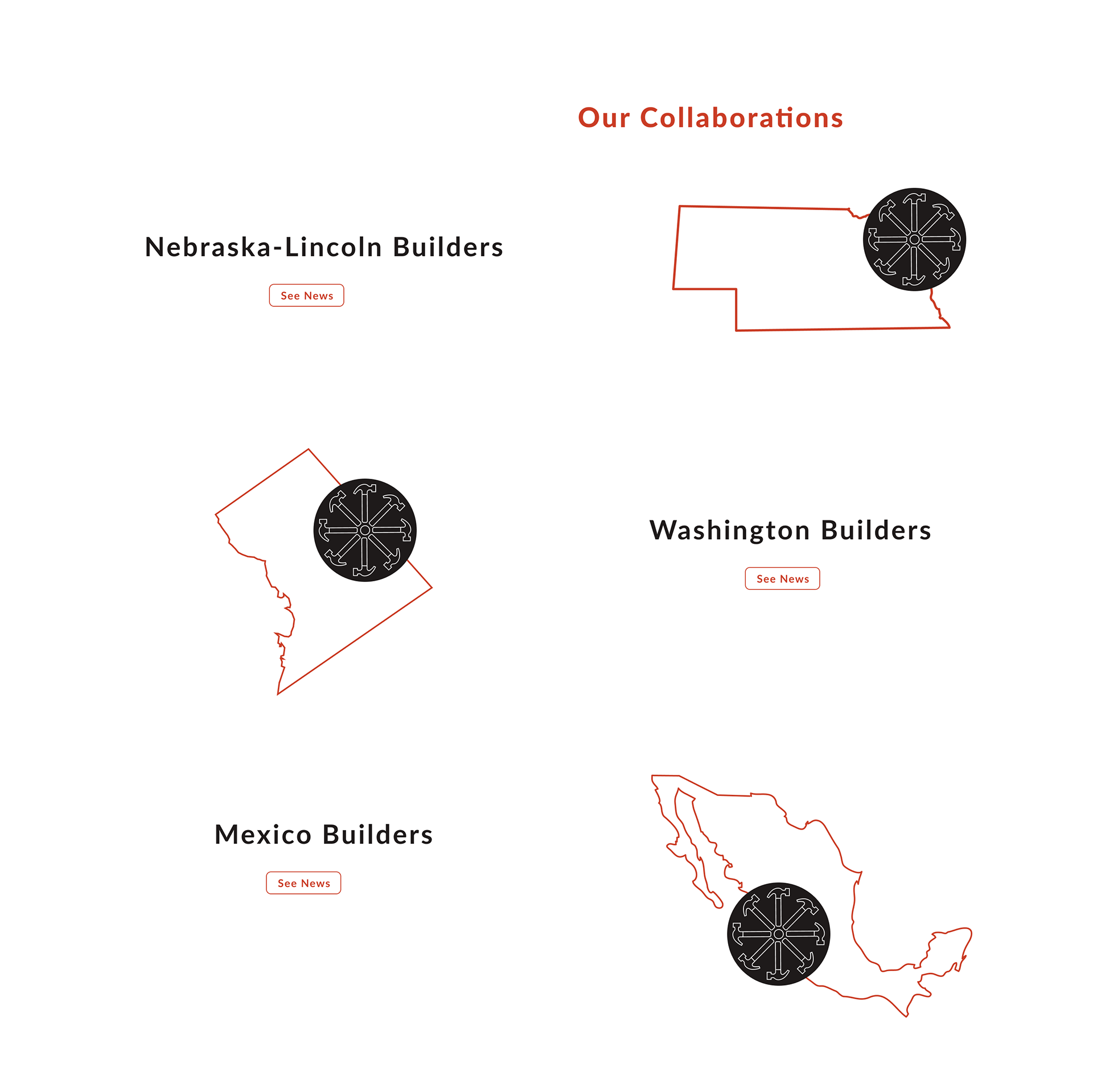
Collaborations Ver.2
Collaborations Ver.3
Combined together, the first mockup of the homepage was the following.
LOGIN
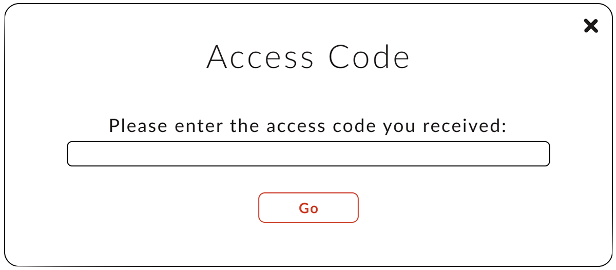
Since the directory and program feed are features only open to the builders and mentors, a login portal was made. As this portal is only for those who have joined or are joining the builders program, not everyone can go ahead and register a new account. So, we implemented a verification process in which only users who have a verification/access code from the organization can register. These codes would only be sent from the organization to specific users beforehand.
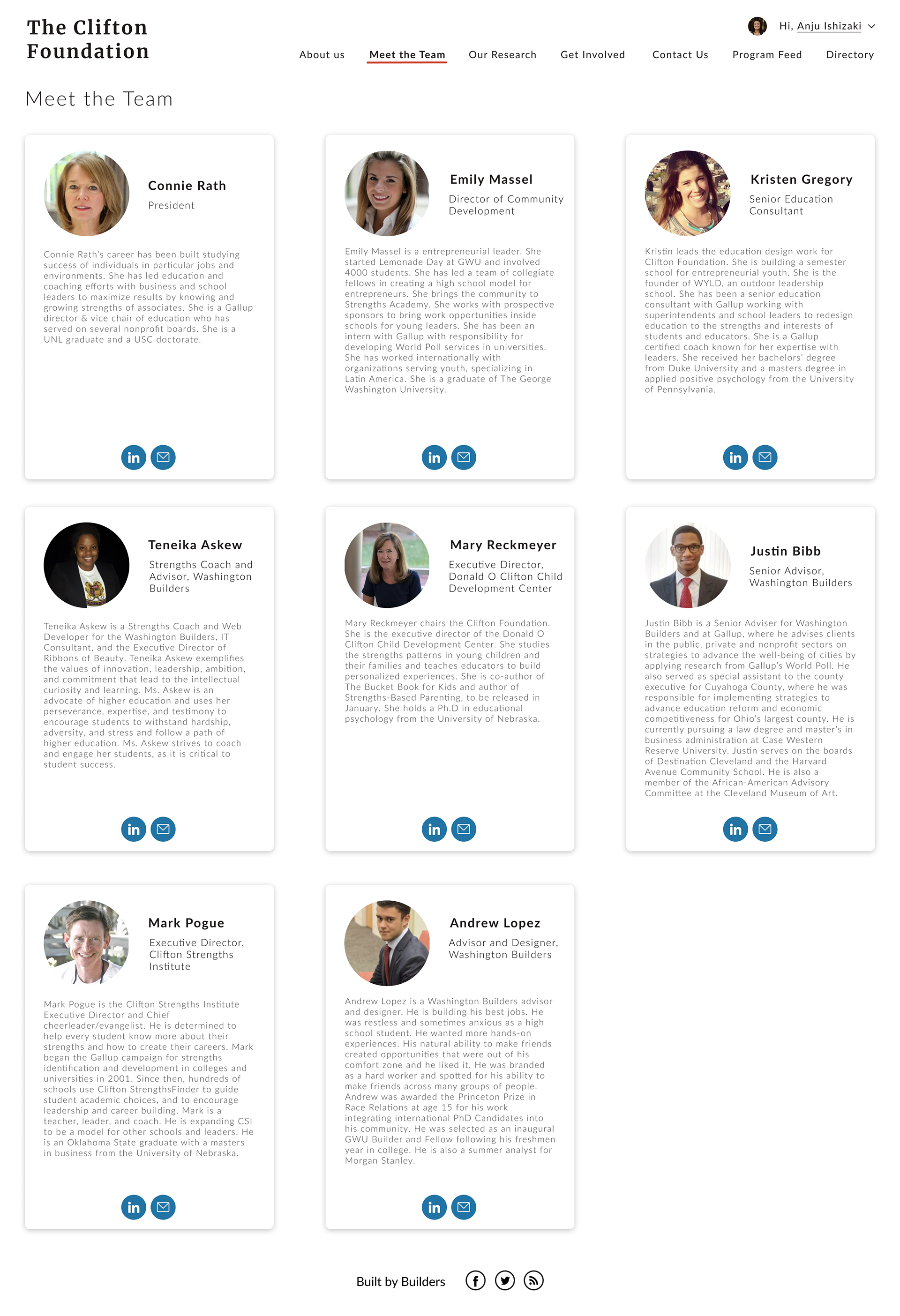
MEET THE TEAM
From ‘Our Team’, we renamed it to ‘Meet the Team’ to make it more welcoming. The redesigned team page incorporates a card design similar to that of the directory for consistency and for code-efficiency. As a highlight, we used the blue color as an accent instead of the main dark red for the linkedin and email icons.
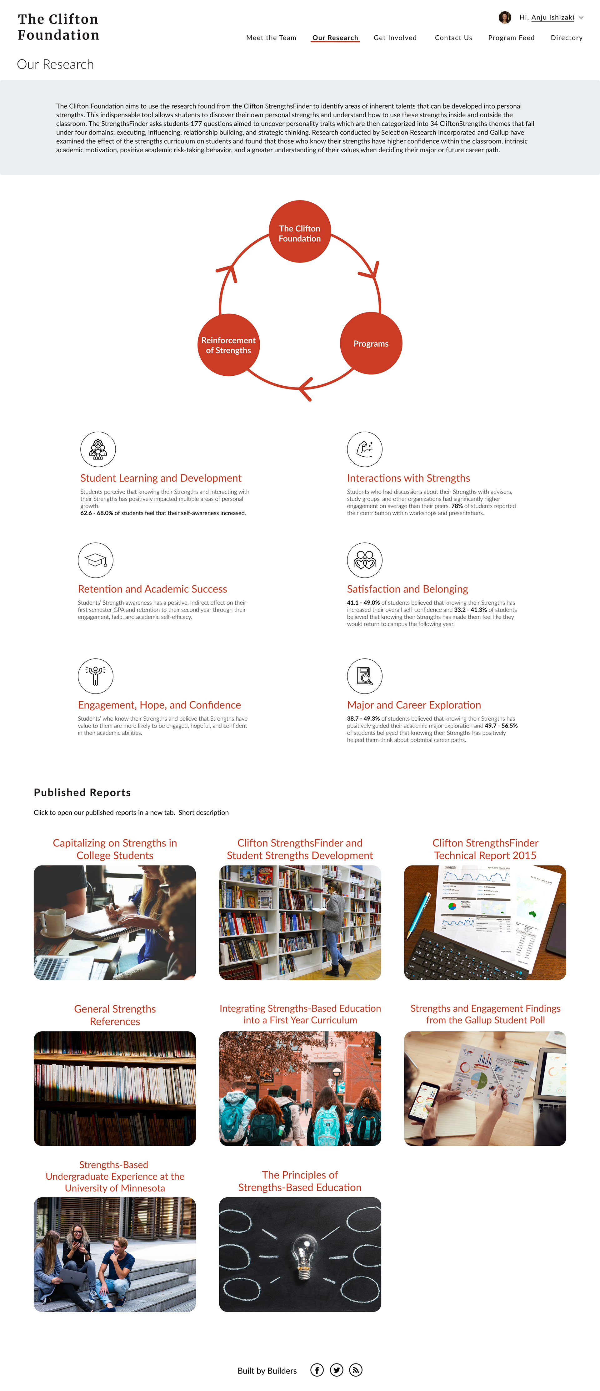
OUR RESEARCH
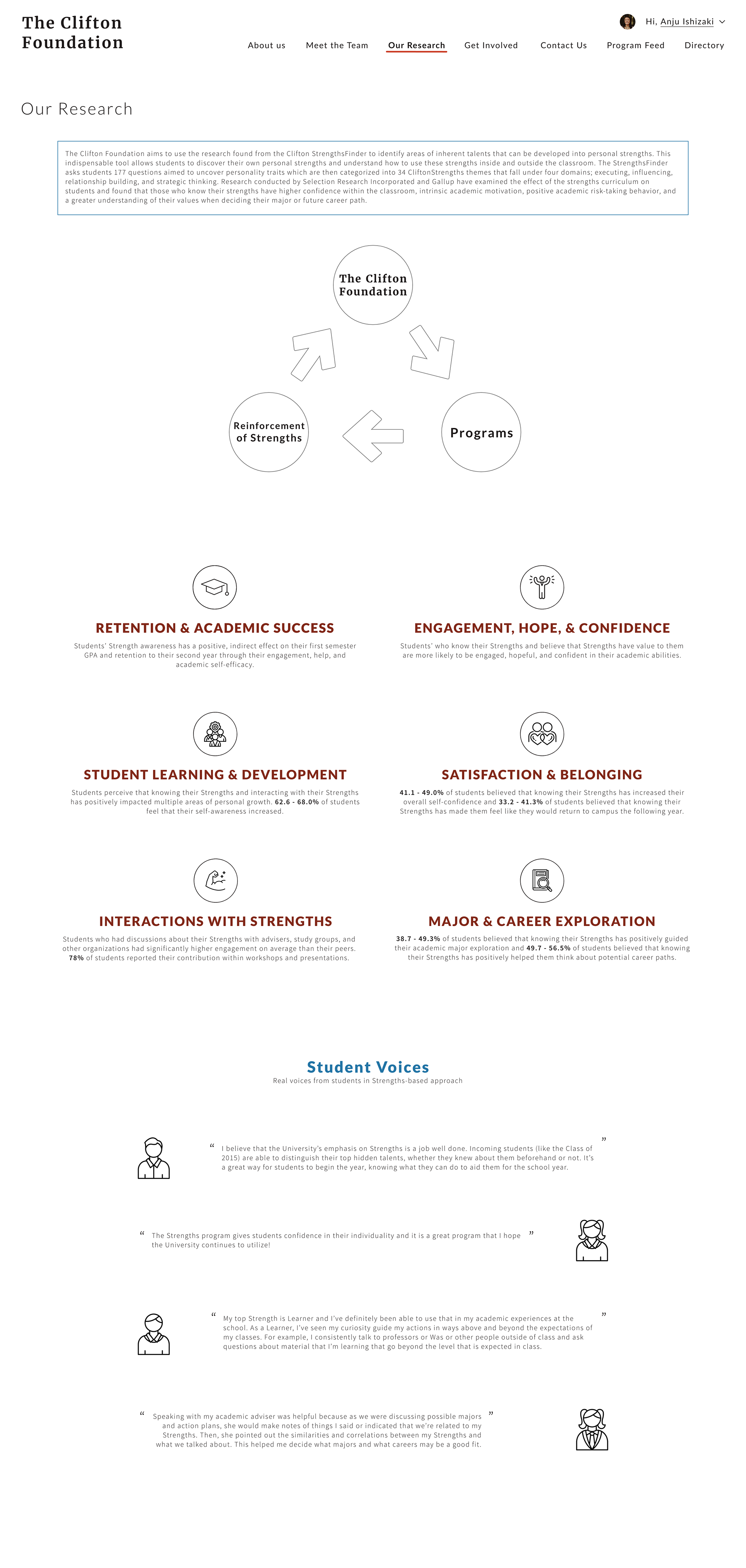
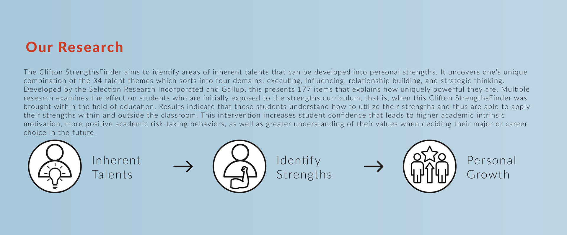
The research page was the page within the current website that we redesigned drastically. The current page does not showcase the organization’s research behind the builders program, but rather links various articles for the visitor to examine through. Although there is a lot of significant and valuable information, without a concise overview with graphics and visuals, it is difficult for the visitor to obtain a clear message behind the organization’s works through a quick glance at the website. So, we went through all of the research articles on the page, as well as researching about the CliftonStrengths and Gallup to create a research statement overview. As numbers have a strong impact on conveying research messages, we also included some statistics. Through additional visuals and details, we were able to condense the information into an easy look at the page.
In addition, we included a section called ‘Student Voices,’ which were found in one of the research articles that were on the previous website. By having this section, students that are considering joining programs would be able to see what other students of the same age have experienced and gained through participating.
In addition, we included a section called ‘Student Voices,’ which were found in one of the research articles that were on the previous website. By having this section, students that are considering joining programs would be able to see what other students of the same age have experienced and gained through participating.
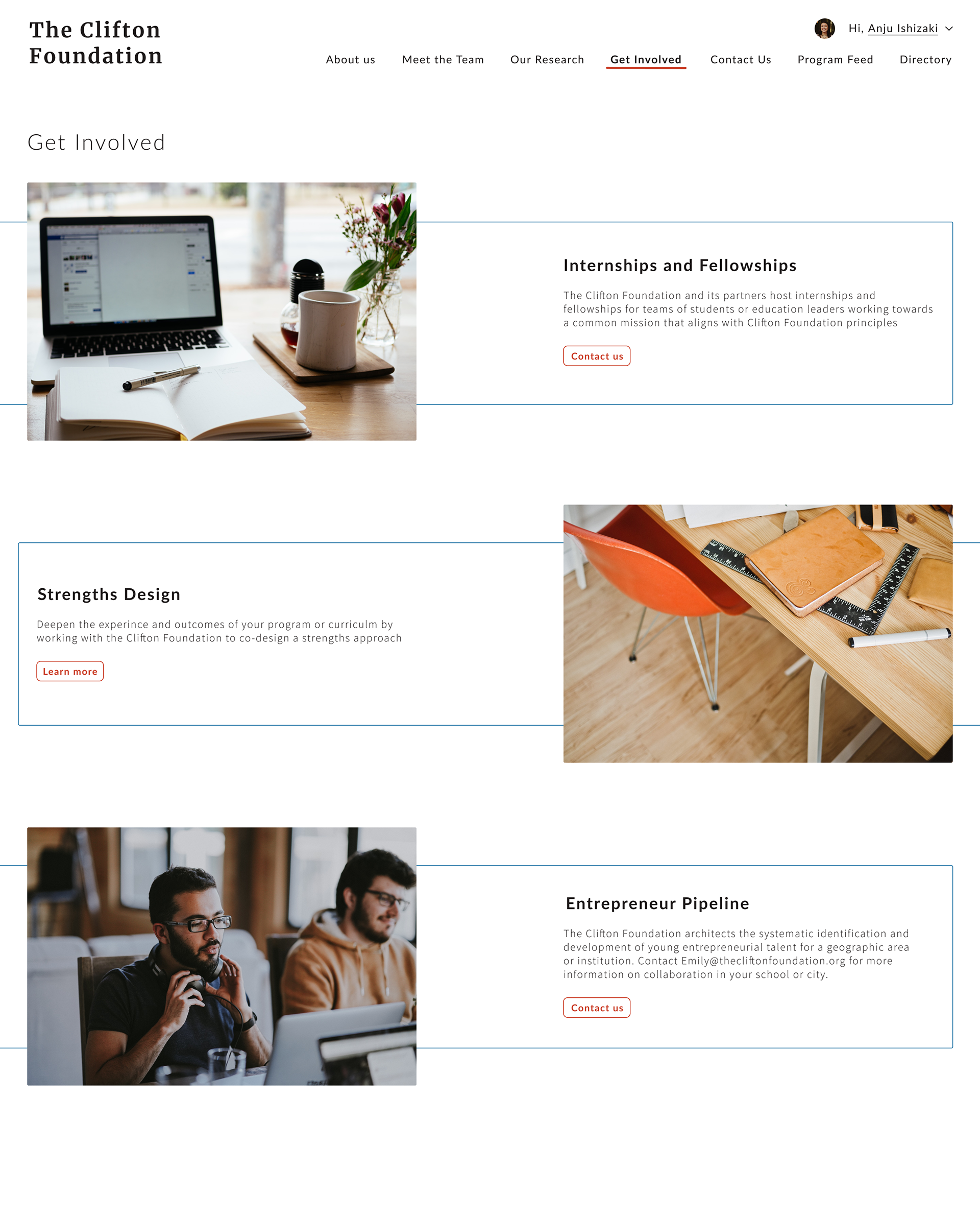
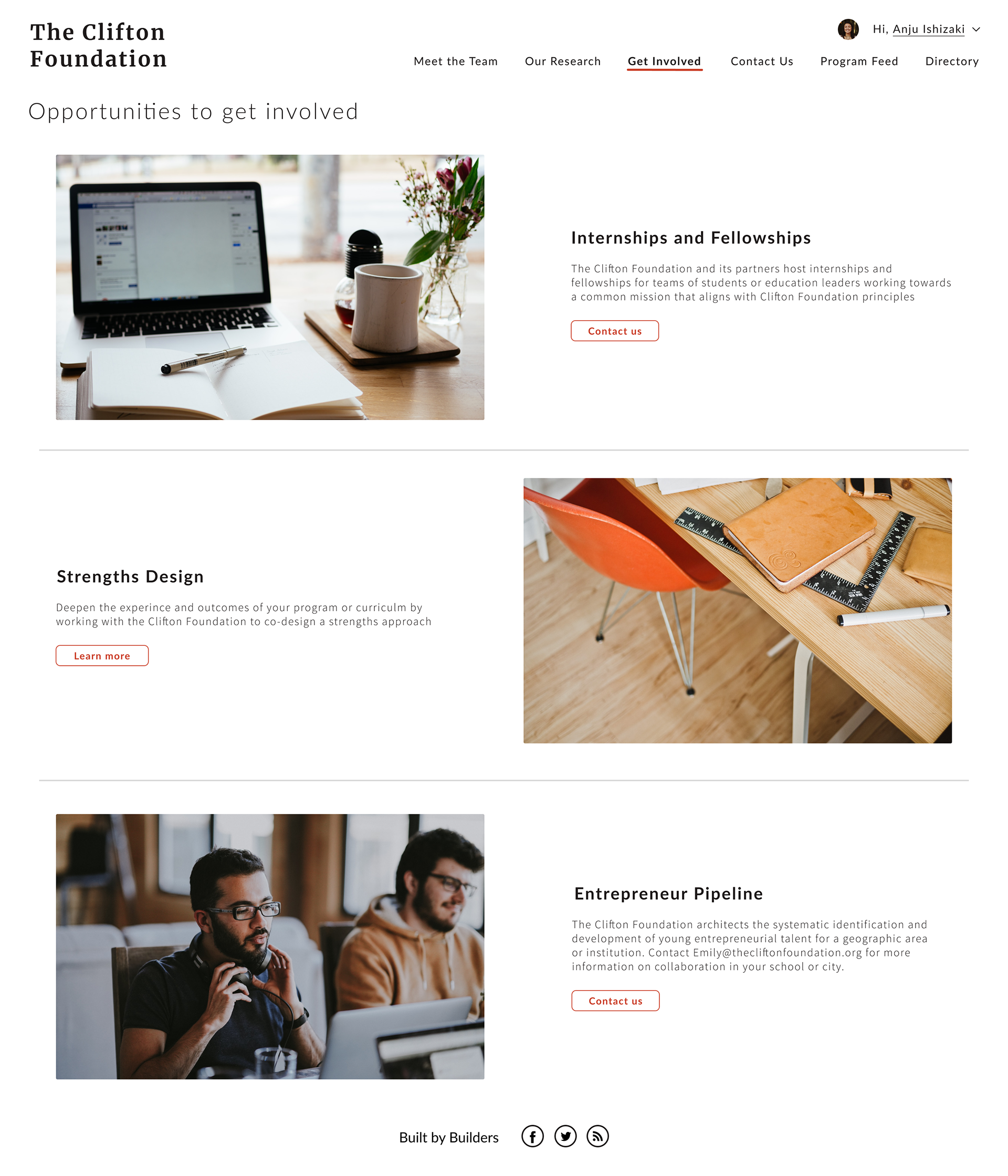
GET INVOLVED
Previously, the ‘work with us’ tab held other links that all led to the same page. Instead, we renamed this to ‘Get Involved,’ where visitors can access all the information that was in the previous site, but in a concise way with pictures and clear divisors. We designed three various ways to design this.
Get Involved Ver.1
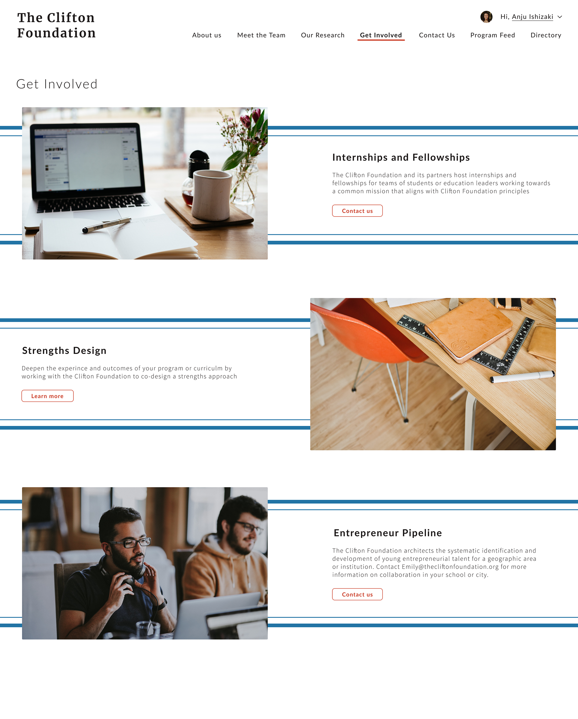
Get Involved Ver.2
Get Involved Ver.3
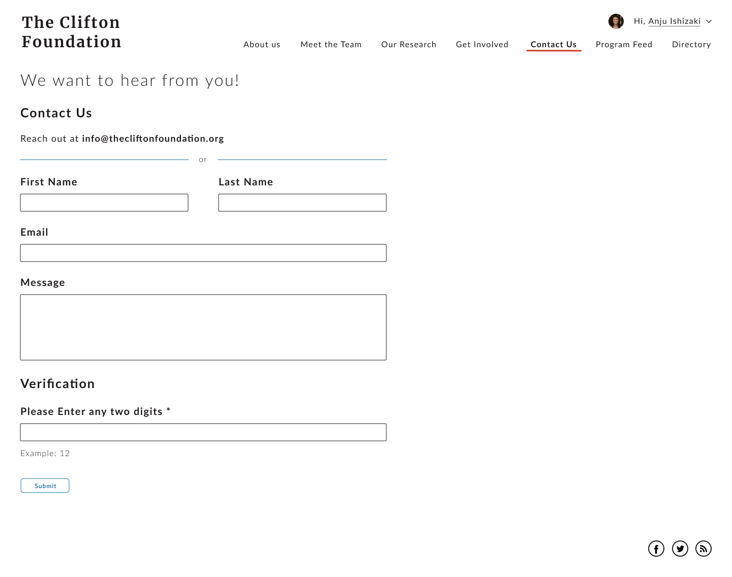
CONTACT
Retaining the same information, we redesigned the contact page to be simple and sophisticated.
MOCKUP VERSION 2
For the second mockup, we modified the pages through more discussion with developers and the client.
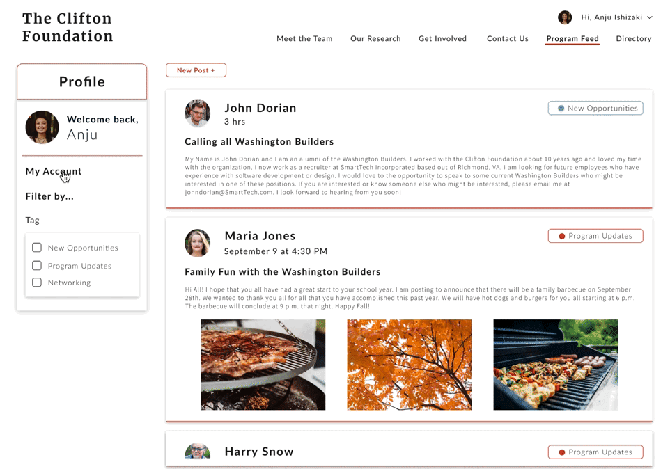
PROGRAM FEED
In order to modify the logged-in user’s profile information, we implemented the ‘My Account’ page under the program feed. This is where users can change their interests, company, location, and add more details such as phone number and a linkedin URL if they would like to. We also deleted some items on the left toolbar as per request.
HOME PAGE
In order to visually divide and sectionalize the homepage, we implemented a light blue background for the research section, along with a small graphic with icons and labels to easily convey the message in this short passage.
Not only showcasing the different builders programs, it was desired that a short description for each program was inserted in this section so that users can have a general idea before individually looking through each builder program. So, we designed these icons to be tabs that will hold the information for each program. We created two different versions for the builders tab.
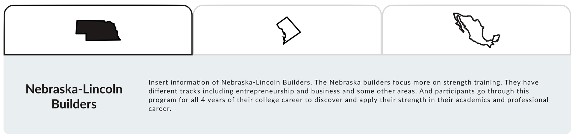
Builders Tab Ver.1
Builders Tab Ver.2
As the first version incorporates the graphic in a more compact way, that is, so that the user knows that it acts as a tab, we decided to go with the first one. The combined home page looks as followed.
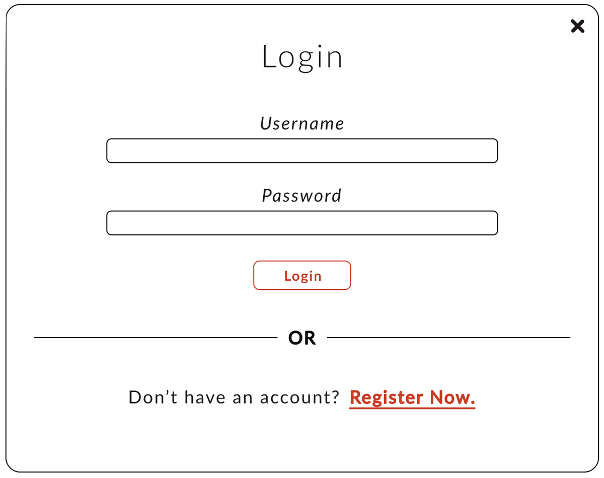
LOGIN
The login portal now also holds both login and registers in one pop-up instead of opening a separate pop-up for verifying the code. Once the code is verified (by comparing it to the database), users can fill in their information to register.
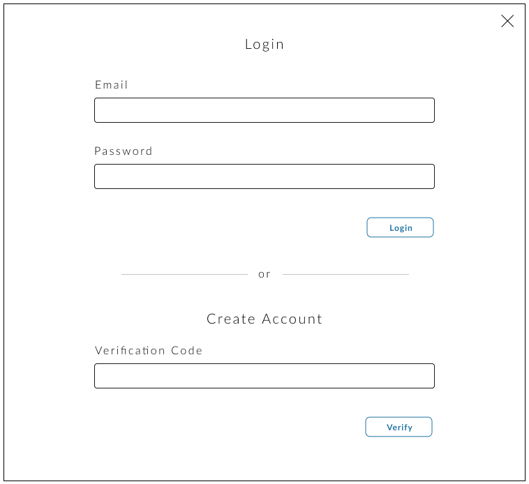
Login Modal
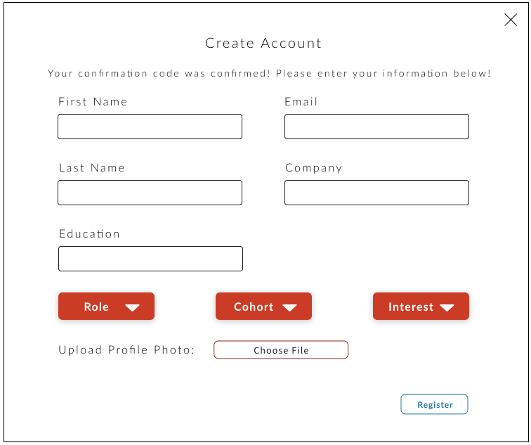
Create Account Modal
OUR RESEARCH
To the previous mock-up, we inserted links to the pdf files as it appeared in the website. Instead of repeating the ‘pdf’ icon/logo for each file, we decided to use different images that match the article to be more engaging. While we added this section at the end, we received feedback that the ‘student voices’ section should be eliminated. The final research page is shown below.
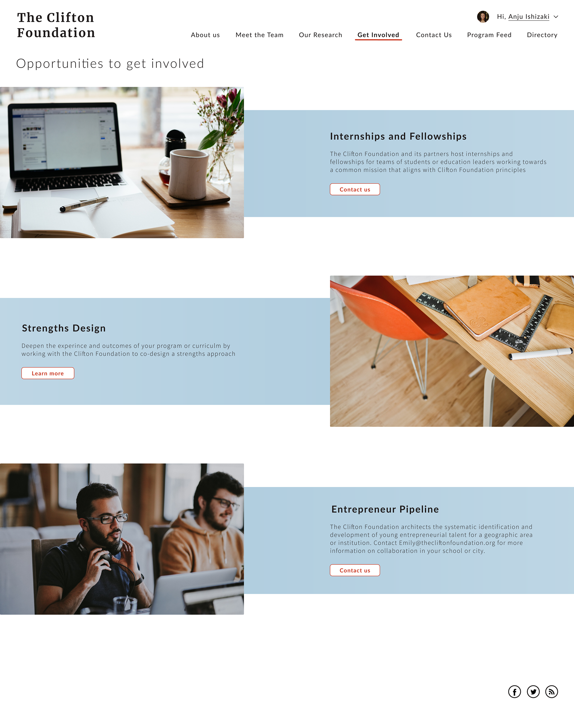
GET INVOLVED
We started a new design for the get involved page that divides the three sections in a single light gray horizontal line that we thought is much more simple and straightforward but also clean.
MOCKUP VERSION 3
Through receiving feedback for our second mock-up, we managed to design our third and final mock-up/product. Most features remain the same, but some details were modified through discussion.
PROGRAM FEED
The short description and education from the user profile was eliminated as per request, so the ‘My Account’ page does not include these forms. Since the client asked to only display the name and the role in each of the individual user profiles, few variations of this design were made. Finally, we decided that the square visual is the best fit as it matched the sophistication and educational message of the website.
User Profile Ver.1
User Profile Ver.2
User Profile Ver.3

User Profile Ver.4
HOME PAGE
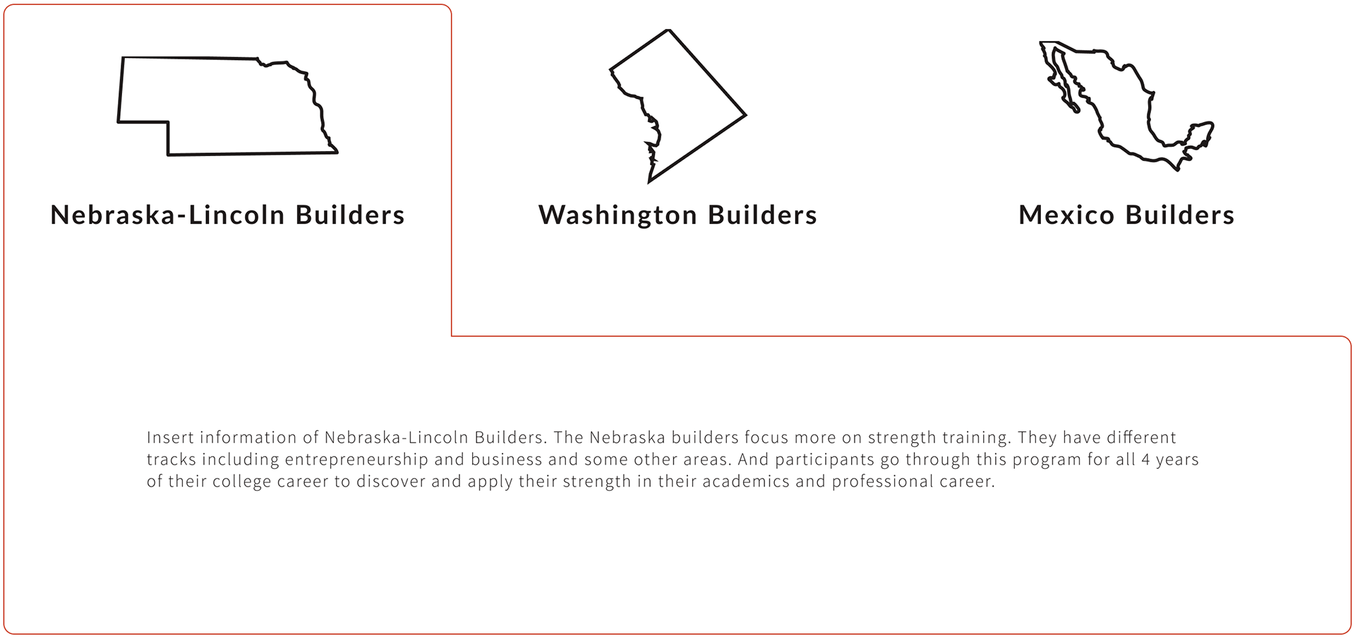
Although we really liked the tabs that navigate through various location icons, some builder programs have changed to those that do not have a specific location associated with it. So, retaining the same tab format, we changed it to text.
🎊 Step 6: Product
Below is the Figma prototype for the complete product!
To visit an interactive prototype, please click the button below.

CONCLUDING THOUGHTS
Overall project structure of redesigning websites
This was my first time through the whole process of web designing, and my co-designer helped me a lot, especially when introducing me to designing or prototyping tools and steps to take before creating actual web designs. Through completing this project, I was able to understand and go through all the project structure steps in detail as written in this page.
Designing as a team
Designing with another member allowed me to understand what it is like to design collaboratively between two or more people. Although it can sometimes be difficult to do this depending on the tools, I found it rewarding and educational to design together. Ideas I would have never thought of would be coming out when planning features. I would get feedback and experience comments for my designs. “How's this?” “That looks great! What if we add this…” Through building upon each other’s design, we were able to create something that is unique to the both of us and combines our skills and knowledge.
Also, as this was my first time web designing, I used various softwares such as Sketch, AdobeXD, and Figma to decide on which works collaboratively. Sketch was very useful and easy to use, but we soon switched over to Figma. I really liked Figma for when collaborating, as you can see and work together on your own computers.
Furthermore, not only the designers, but a whole group of developers are in the team. I also realized how important it is to also think about the developers when designing, such as implementing designs that can be reused rather than being random and time-consuming to code.