Type: UX Design, UX Research, Front-End, Back-End
Role: Lead UX Designer, Front-End Programmer
Team: 3 Designers, 2 Developers, 1 Project Manager, 1 Mentor
Tools: Figma
Stack: Python (Django), HTML/CSS, MySQL
Duration: June - July 2020, 2 months
OVERVIEW
During the global pandemic of 2020, I had the opportunity to join InternHacks, a tech internship x hackathon community. With the mentorship of a current Netflix engineer, our team MK2Lab created a platform that aims to aid those that were impacted during this time, namely students, volunteer organizations, and small businesses. We used Agile to facilitate our development environment, where we had virtual stand-ups every other weekday for the duration of InternHacks. Each week, we wrote and submitted our project progress reports to the judges. Our team won the awards of Best Status Reports Award at the end of the competition.
PROBLEM STATEMENT
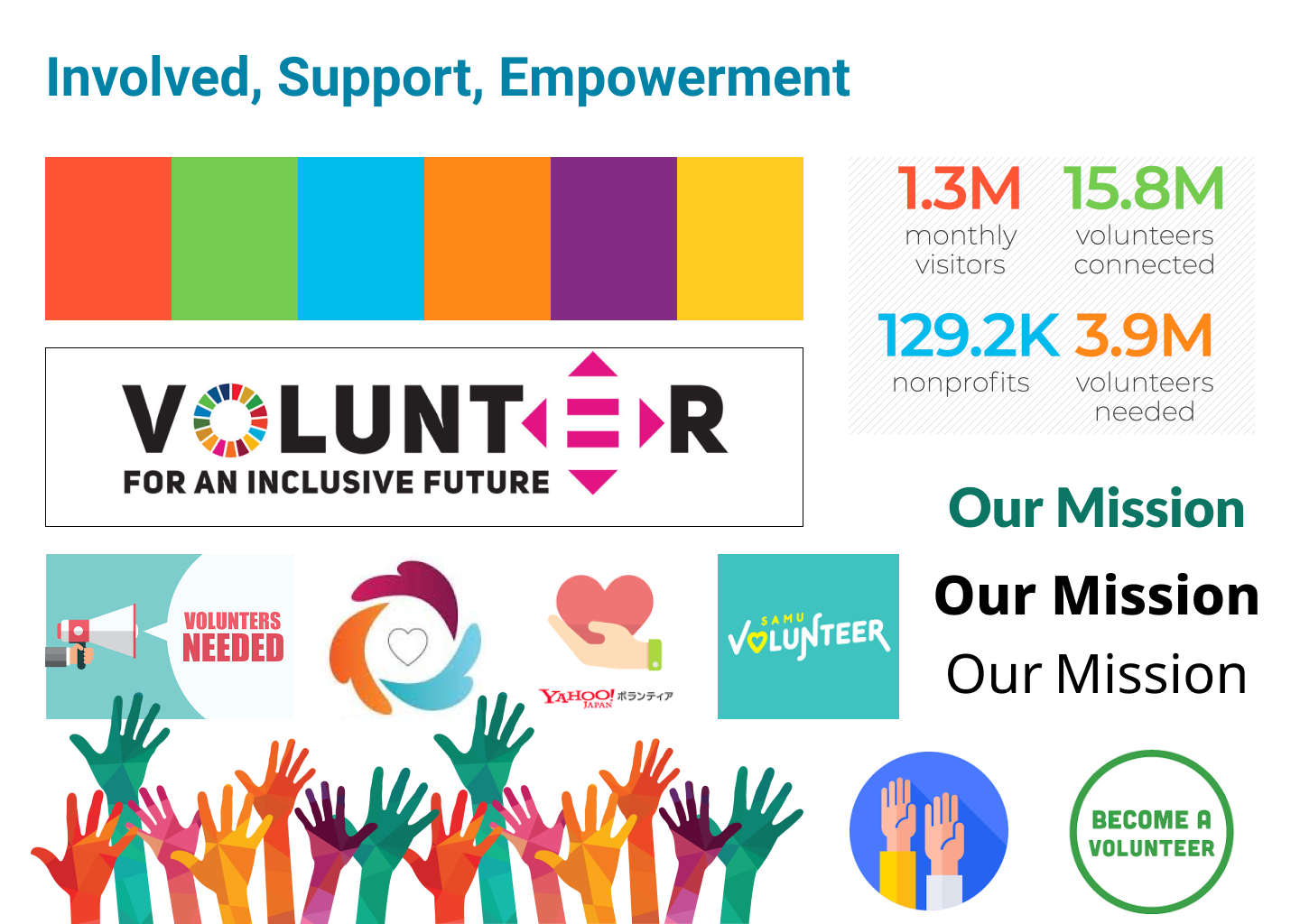
As of 2016, approximately 63 million Americans volunteer their time and 55 percent of youth ages 12 to 18 serve to make a difference in their community. However, students lack a platform to take the initiative for community service and compare different services they can work on. In addition, local small businesses are struggling to bring customers into their stores and carry out effective marketing campaigns. Furthermore, due to the recent setback of the COVID-19 pandemic, many small businesses are losing the footwork that they need to sustain their businesses. Additionally, many nonprofit organizations are struggling with exposure and recognition for their specific cause.
SOLUTION
Simpact, a web app platform where all users can interact in order to get what they need, right away. Student volunteers can search for volunteer opportunities, and in exchange receive points for their community service, non profit organizations will have access to a community of eager volunteers that they can communicate with and recruit, and small businesses can opt in to be “redeem locations” where users can use their points and exchange them for perks, in which they will get more foot traffic and customers during this tough time.

PROCESS
🤔 Step 1: User Research
As a whole group, we determined our three target users: students, volunteer organizations, and small businesses. Thinking back as high school students, conducting surveys, and researching online, we determined some key problems that each user had revolving around volunteer opportunities and foot traffic due to the impact of COVID-19.
STUDENTS
・ High school students often need community service hours, but have difficulties finding places to complete those hours. Clubs, like National Honors Society, International Baccalaureate Program and student run clubs often require community service.
・ Many students are unaware of the diverse volunteer opportunities available to them in their community and have no easy way of comparing such opportunities.
・ High school students also have no platform right now to track those hours
・ Other volunteers such as parents might want to volunteer with their own kids, but don’t know places that are kid friendly
・ Would bring volunteers to families and friends
・ Difficulties finding places to complete essential hours
・ No platform to track hours completed
NPO, NGO Organizations
・ NGOs and Nonprofits often need many more volunteers that they can find. Traditional community outreach/recruitment can be timely and expensive.
・ Big events usually attract large crowds but everyday tasks are not as popular, which means less volunteers.
・ Smaller nonprofits may have difficulty cementing a name for themselves, and getting the word about their mission out.
・ There is shortage of volunteers for NGOs and Nonprofits.
・ Provides smaller organizations a chance to spread the word
SMALL BUSINESSES
・ 100,000 businesses have shut their doors due to COVID-19
・ Perks generate traffic to a small business, generating loyalty and sales
・ More foot traffic means word of mouth, essential for business
📓 Step 2: Agile - User Stories
With the guidance of our mentor, we utilized Agile software development pipeline during our few weeks. One of the key components of agile was to create user stories. From our user research, we were able to bring in personas and user scenarios to identify the crucial pages and features of our web app. For our user stories we answered the questions:
1. Who is the user?
2. What do they want to accomplish?
3. Why do they want to accomplish that?
In the form of:
I, as a ___________
Want to ___________,
So that ___________.
After writing multiple and various user stories, we divided that up according to the persona, then identified what feature or page that would correspond to in our web app.
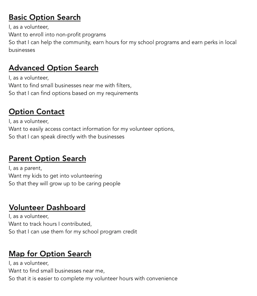
Volunteer User Stories
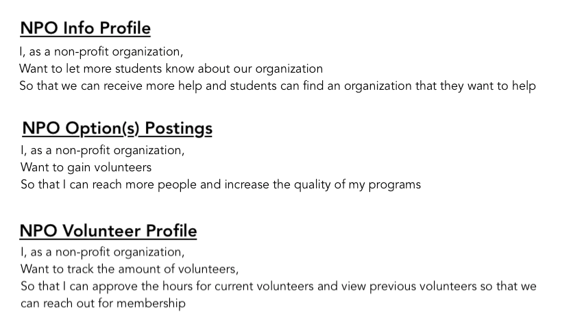
NPO User Stories
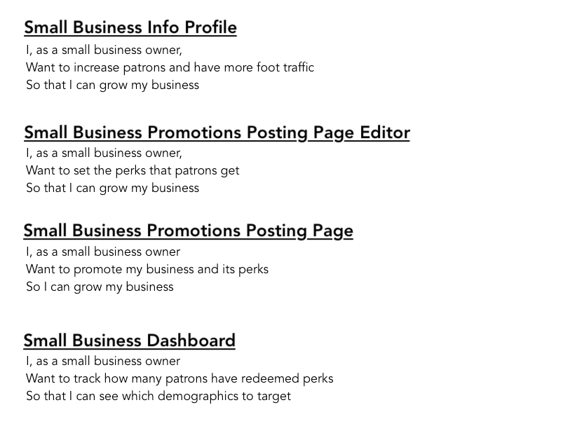
Small Business User Stories
📋 Step 3: Moodboards
Members of the team each researched through dribbble and volunteer websites to create a moodboard. Mine is shown here.
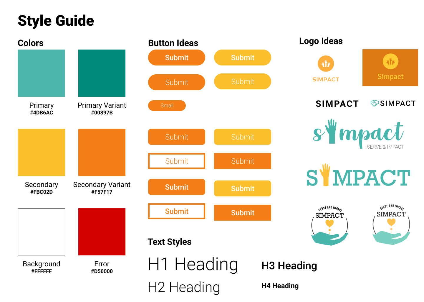
📚 Step 4: Style Guide and Logo
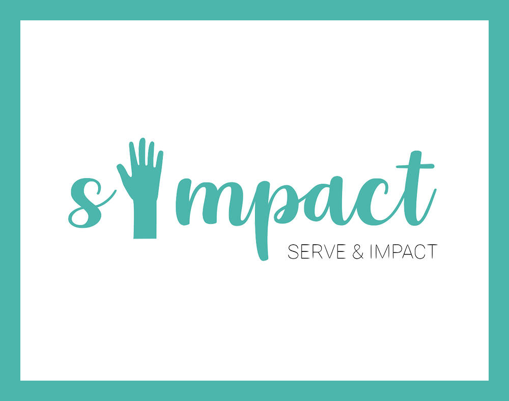
After everyone came up with their moodboard, we discussed some of the highlights of the features we saw. At the end, we decided to go with a main green color as it is associated with education, and its highlight color as yellow to give a bright image to our web app.
Coming up with a name and its logo was a challenging process. As a group we threw some naming ideas into the bucket, and voted for Simpact, which is a combination of serve and impact. When creating a logo, I wanted to symbolize how our platform enables users to reach out to one another and create a positive impact cycle amongst the community. In order to do so, I wanted to place a graphic of a hand. At the same time, since I love how the name Simpact originated, I wanted to put the phrase “serve and impact” within the logo.
🔧 Step 5: Wireframes and Prototype
As the lead designer, I decided to utilize Figma for our project since remote collaboration can be easily done, which was especially crucial as we were not able to meet in person. Furthermore, Figma also allows users to give feedback, and we utilized this tool so that non-designers were always able to provide us with comments and knew how the designs were developing. Since there were three users and three designers, we decided to divide the work up. My fellow designer Lisa was in charge for the non profit organizations, Kenthia for the student volunteers, and I for the small businesses. At this point, consistency was definitely necessary to keep the three different user modals similar. I took the time to explain and go over some basic Figma tools, providing additional help sessions if necessary as it was their first time designing and using online designing tools.
For each user, there were several different types of pages. I will be focusing on the small businesses’ pages which include the dashboard, perks listings, promote, perks design, and create new advertisements.
WIREFRAME VERSION 1
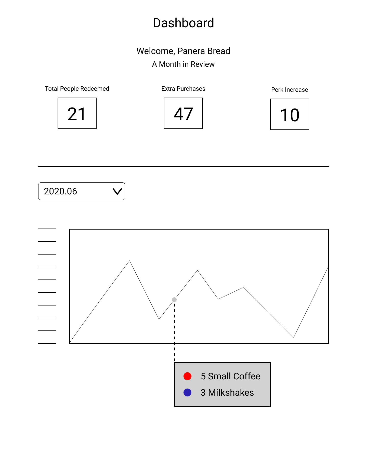
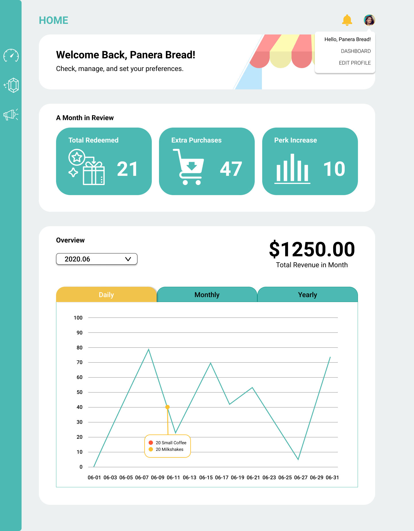
DASHBOARD
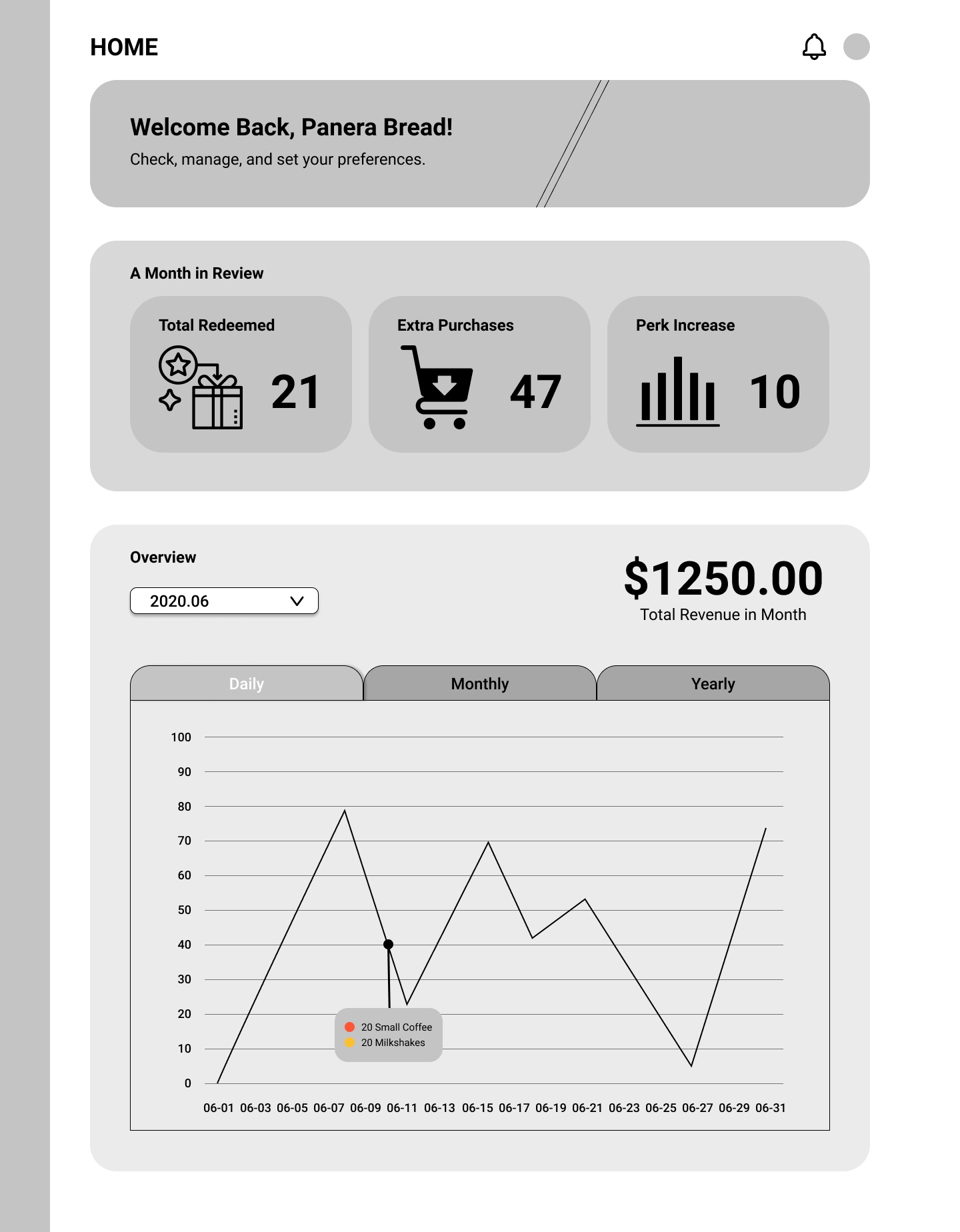
We wanted small business owners to be able to track how many patrons have redeemed their perks as well as any purchases they made in addition to their redeemed product. Through this, we believe that owners are able to identify how to promote and target their demographics. Furthermore, I wanted to include a graph that visually represents the perks that people purchased as the dashboard would be the first page that owners would see once they login to Simpact.
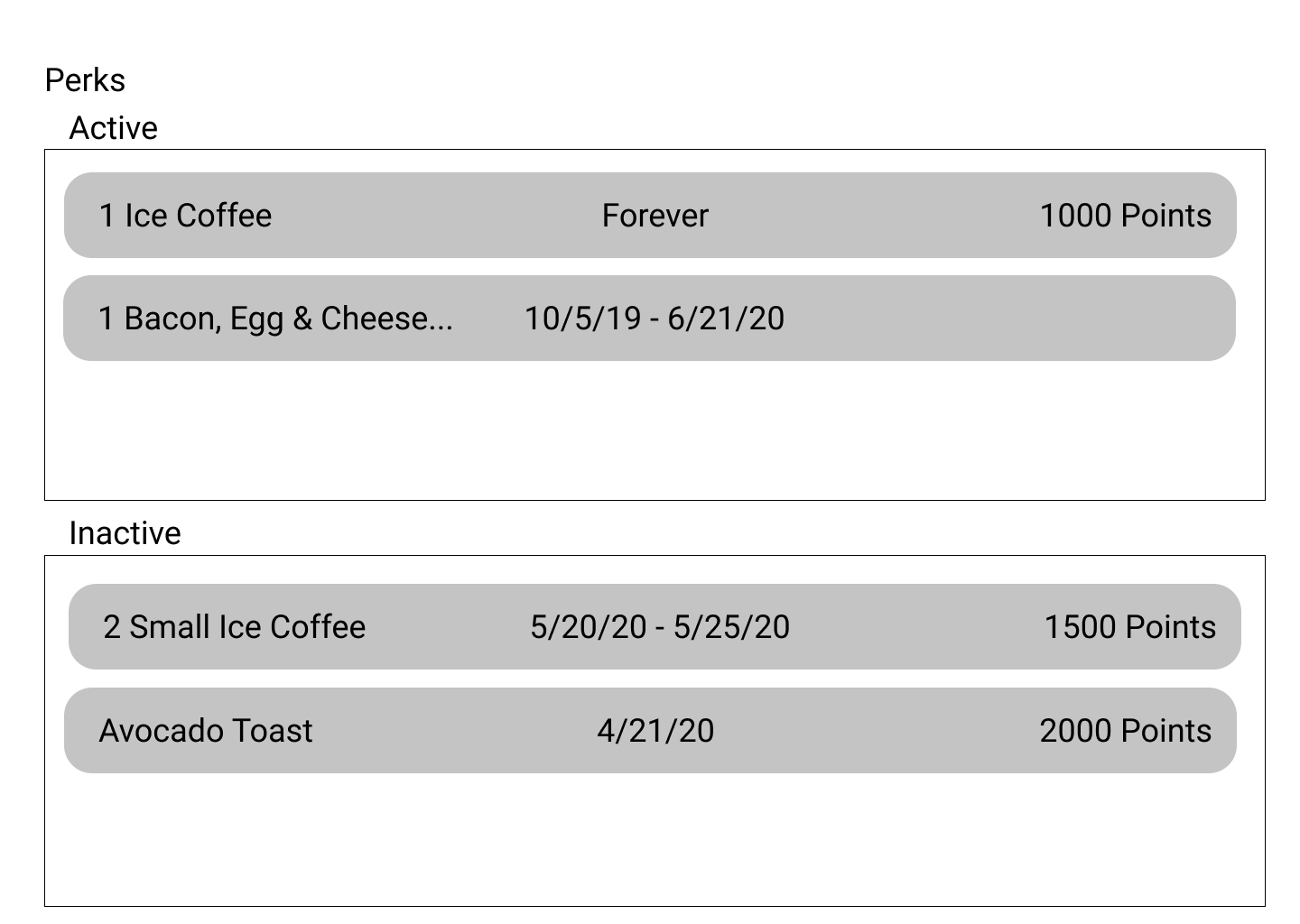
PERKS LISTINGS
The perks listing page will list their active and inactive perks so that owners can easily be able to identify the usage of perks when people come to redeem their product.
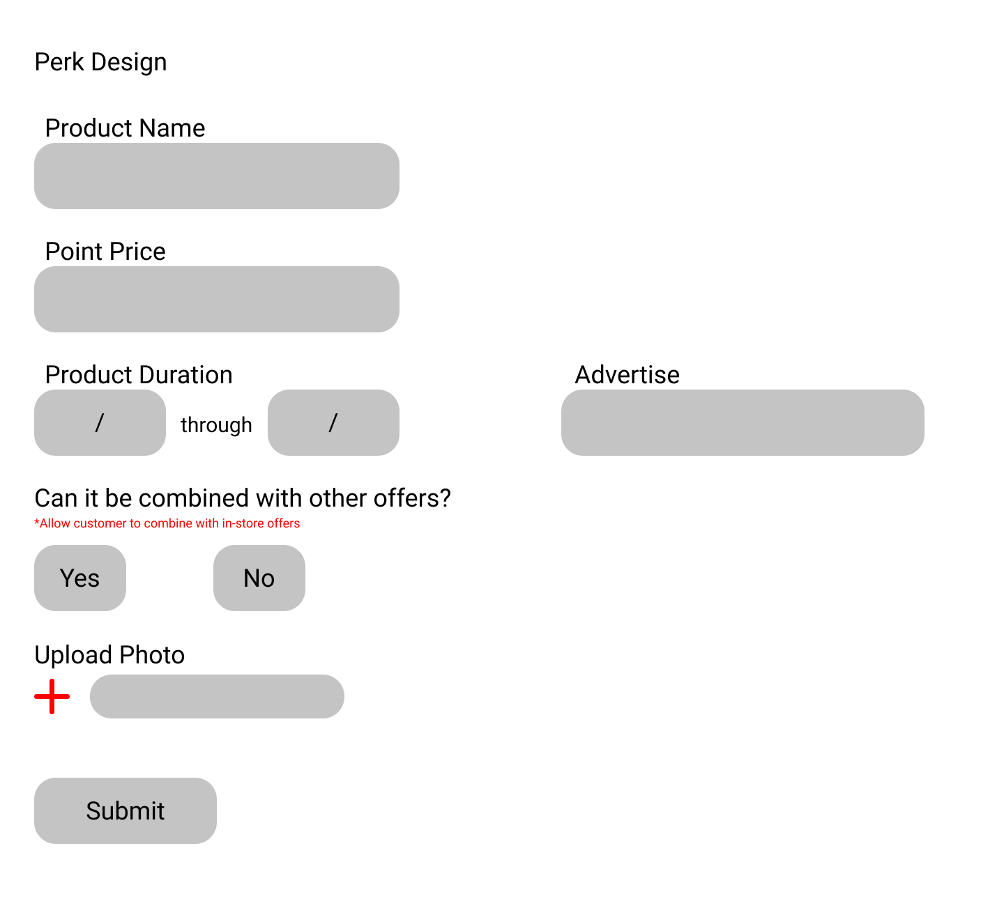
PERKS DESIGN
The perks listed in the above page will be created in a form in the design page. This is where owners must include necessary data such as the product name, price in points, and duration.
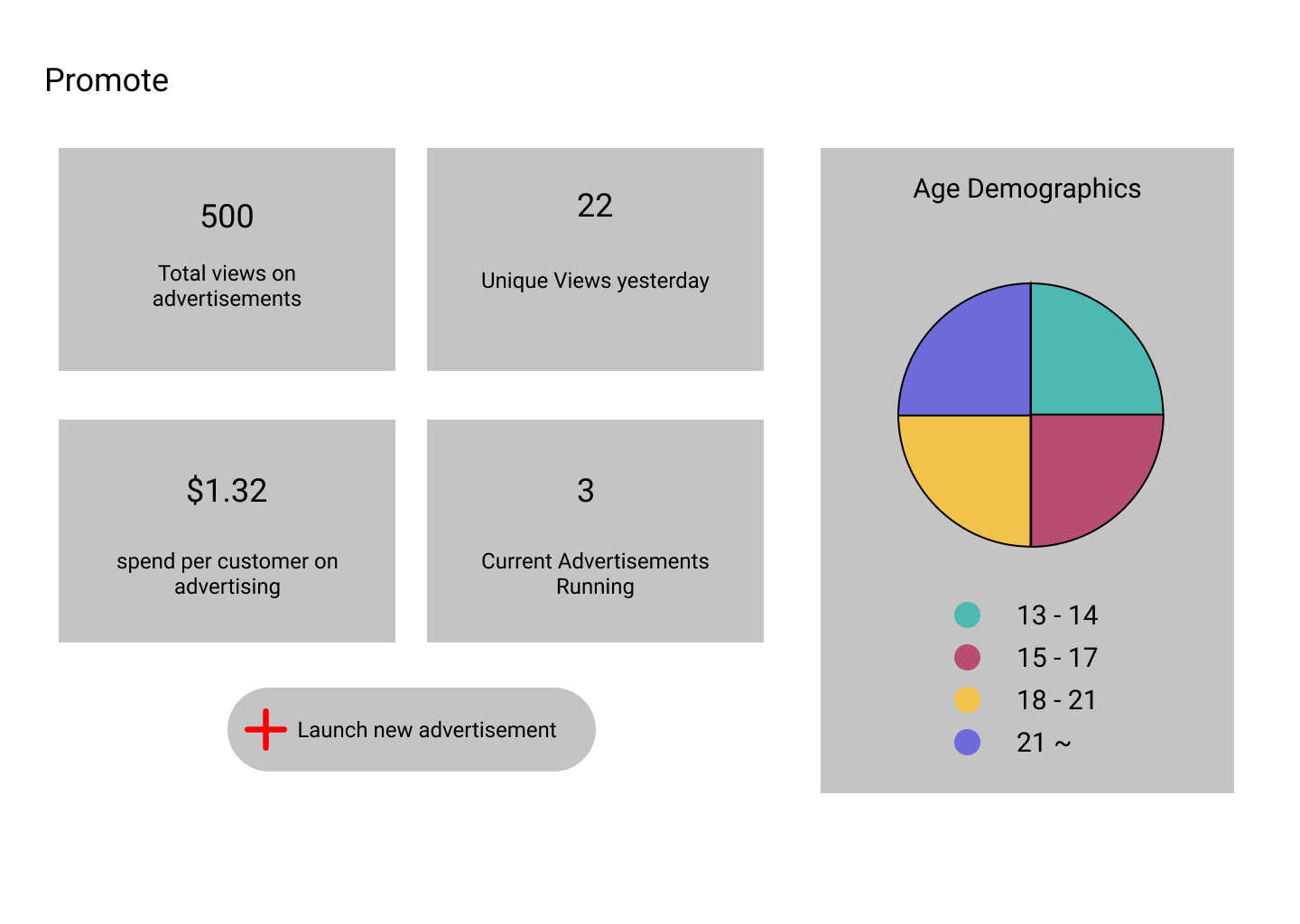
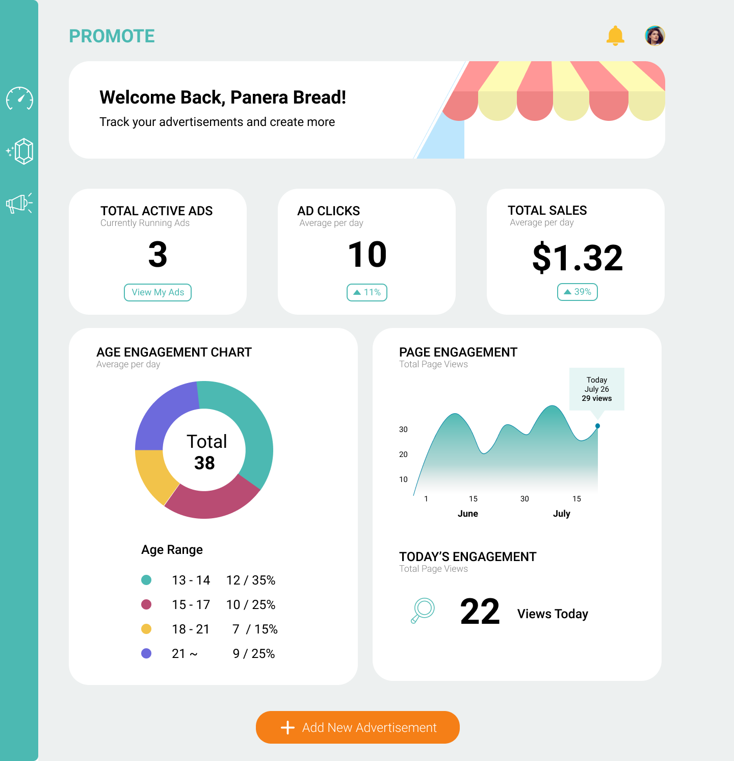
PROMOTE
The promote page is where the owners can view the qualtrics about their advertisements and leads to a page that creates advertisements. There are also graphs and numbers that allow the owners to visually and numerically view information about their advertisements and further make decisions about them.
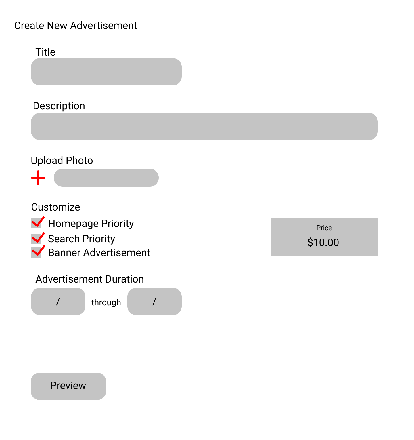
CREATE ADVERTISEMENT
The creating advertisements page would be very similar to the perks design page for smoother and consistent development. Before submitted and creating a new advertisement, users can preview to ensure no mistakes are made.
WIREFRAME VERSION 2
DASHBOARD
For the next step, I created a design that visually looks more like a web app. This incorporates a static side navigation bar that would be the same for all users, but would hold different pages across those users. For this I included more visual elements such as some graphics to enhance engagement, rather than just numerically representing information about their perks. Furthermore, this allowed us to have the same dashboard template across all users, which was necessary when developing this on the front-end.
PROTOTYPE
Utilizing the color scheme and wireframes, we created our high-fidelity mockups shown below.
DASHBOARD and PROMOTE
From the above new designs, I created high-fidelity mockups for the dashboard and promote pages.
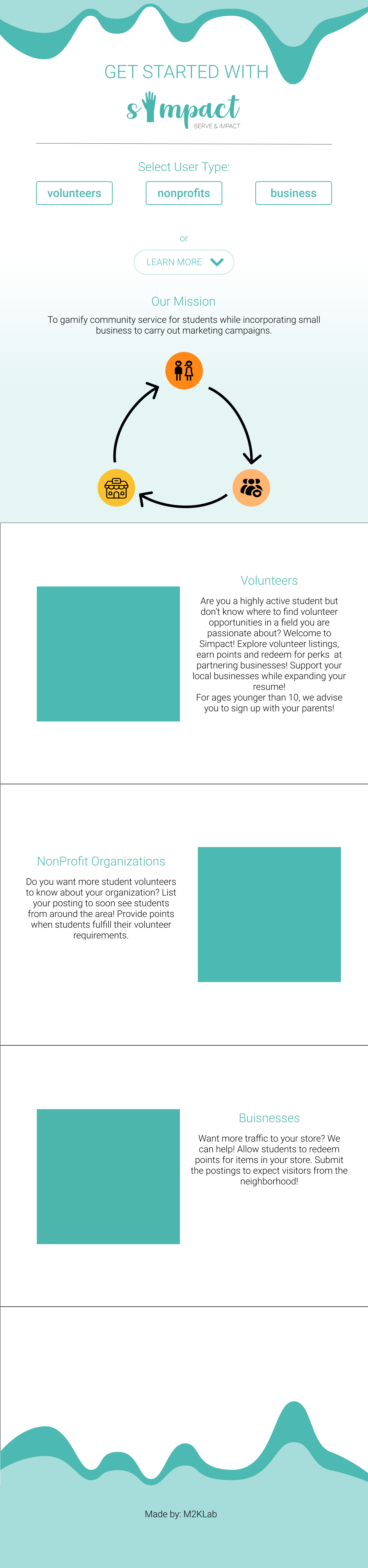
LANDING PAGE
Since we also needed a landing page for Simpact that can be accessed by all users, I designed the following:
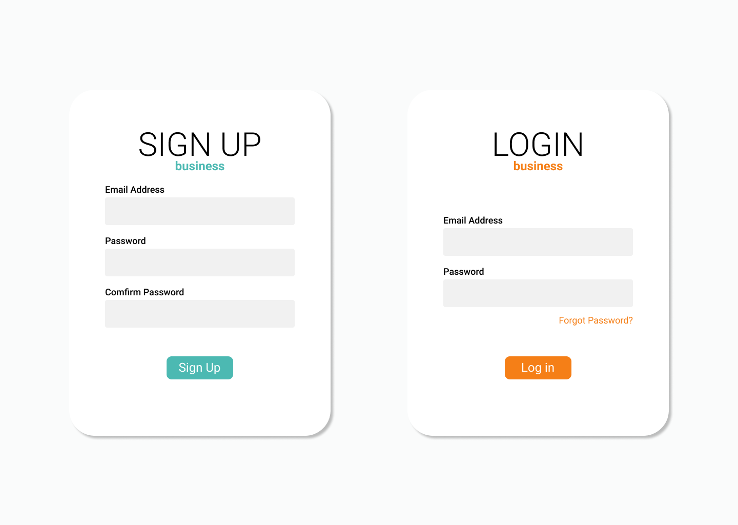
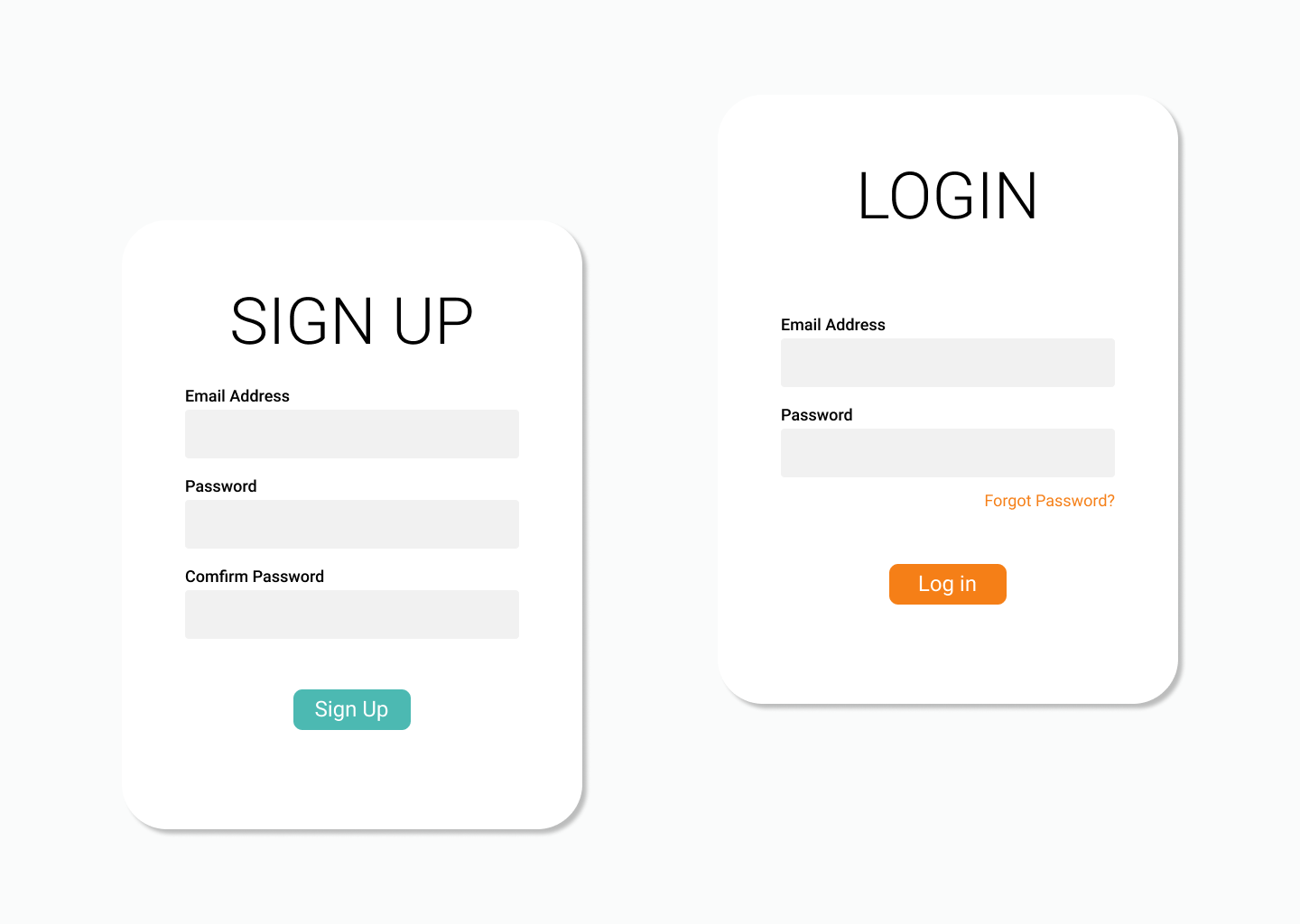
LOGIN / SIGN UP
Once the users select their identification on the landing page, it will lead them to the login and signup modal that checks with our profile database or creates a new account. There were three various versions I created, in which we decided to use version 1.
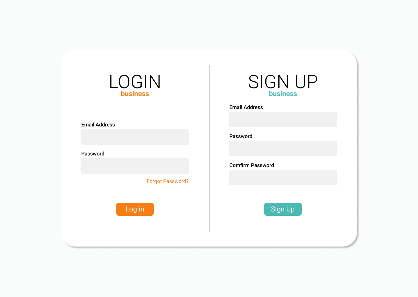
Login / Sign Up Ver.1
Login / Sign Up Ver.2
Login / Sign Up Ver.3
💻 Step 6: Development
As the designing process was coming to an end, I started working on the front-end code for our website. Since some were new to HTML/CSS and Javascript, I decided to create a template dashboard with reusable html tags and already defined css such that the other designers and developers were able to copy and reuse that and only having to change certain images or graphics.
Since Django has a template system, I created a base html that defines the side navigation bar and some of the boxes in the dashboard, so that other team members can just extend on their html page. This allowed efficient translation when different members worked on various pages at different times, and easier management of the code by those that were unfamiliar or inexperienced with web development. For the pages that had forms, we utilized Django forms to easily translate it to visually pleasing ones but altering and creating the CSS respectively.
As for the back-end of the web app, we focused on being able to install those three user personas. We used routes so that only authenticated users that identify as one of the three were allowed access to their respective dashboards. Furthermore, I used the built-in Django admin tools to handle user authentication and further troubleshoot problems throughout the development.
🎊 Step 7: Product
We showcased our work to the judges on Demo Day, the last day of InternHacks with a small video I created that showed the functionality that we were able to create.